The Mobile Viewport and Orientation
By Mike Sierra
Summary
Here you’ll learn how the mobile viewport works, and how it affects what appears on the screen when tipping the handset.
Applying a viewport is the first and most important step to make web pages presentable on mobile browsers.
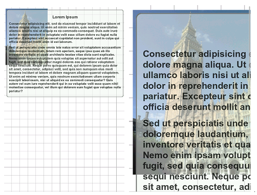
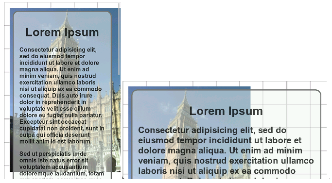
Touch-based smartphone browsers are capable of presenting web pages designed for desktop browsers, but that experience needs improvement. When loading full-sized pages, mobile browsers display the entire page at reduced magnification. Users must double-tap or pinch the screen to magnify individual columns of content. Even then, text targeted for full-sized browsers often features long line lengths that make it more difficult to read on smaller mobile screens. This shows how a typical web page layout displays on a mobile screen:
Users are obliged to go through several steps before text becomes legible, in this case including tipping the handset to increase the column’s magnification. When users reach the end of the column, they often experience difficulty re-orienting themselves within the page. In this case, even the image doesn’t appear within the screen, because it is placed in a different column within the layout.
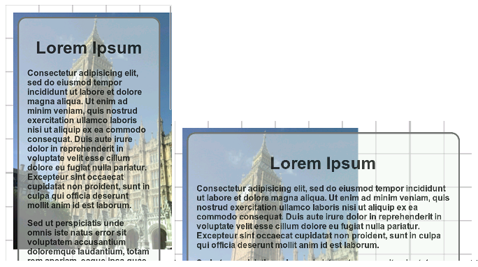
The fixed rectangular area within which touch-based smartphone browsers display larger web pages is called the viewport. Applying a viewport meta tag allows you to control how mobile browsers render content within this rectangle, and whether users can magnify the page.
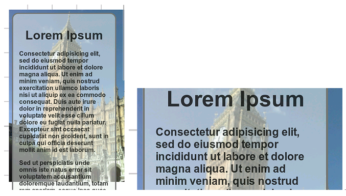
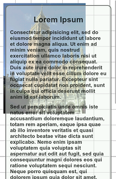
The following shows a sample screen layout without a viewport. (For the sake of illustration, it displays a flexibly positioned text element that adapts to the full width of the screen, along with a fixed-size background image.) The initially loaded page is zoomed out much too far to be legible, while zooming in makes content extending off the right edge of the screen difficult to access:
This reflects the browser’s default assumption that content should extend 980 pixels wide. Mobile browsers must make that assumption in order to render pages that are not optimized for display on mobile screens.
To override the browser’s default behavior, place this line within the HTML’s head region:
<meta name='viewport' content='width=device-width' />
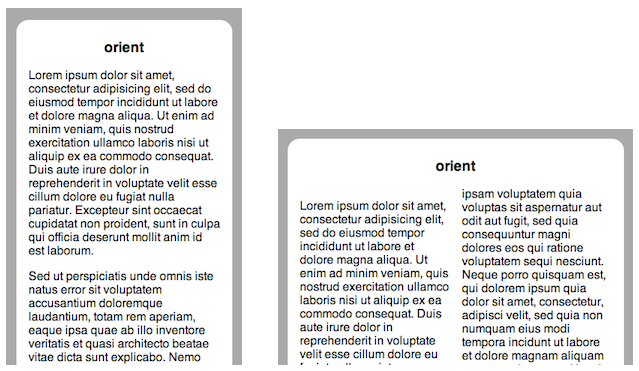
Here’s how the screen layout looks after you apply the viewport:
Setting the viewport width to device-width recalculates flexible CSS measurements (such as the width:100% CSS property) within the width of the handset’s screen rather than the default page width. Tipping the handset maintains the overall width of the content within the wider window.
On most touch-based mobile browsers, the device-width is 320 pixels. Make sure images and other fixed-dimension elements are sized accordingly. The screen height varies significantly among handsets, and may even vary on the same handset when running full-screen web applications that suppress the browser’s native screen controls.
Applying a viewport has no effect on desktop browsers. It is interpreted only once when the page loads, and cannot be modified thereafter.
Viewports can also specify a fixed-pixel width, but this is not a good practice:
<meta name='viewport' content='width=320' />
Specifying the number of pixels effectively means the page won’t appear properly on wider tablet devices whose browsers also support the viewport meta tag. It is unsustainable overall as differently sized devices become available. Use device-width to cover all devices, then use CSS media queries to flexibly adapt layouts to suit different screen sizes. Overall, it is better to specify flexible measurements such as percentages or em units than fixed-pixel measurements.
Control over panning
The width=device-width viewport shown above forces content to scroll downward, though it can still extend past the left and right edges, and may even be positioned outside the visible screen. By default, horizontal panning is disabled when the content fits within the viewport.
Use CSS’s translate() transform function if you want to stage hidden interface elements off the edge of the screen. CSS transforms produce a more superficial visual effect that doesn’t modify the overall dimensions of content within the page.
If you use absolute positioning, for example by setting a layout element’s left property past 100% of the page width, it makes the overall content wider, and makes the otherwise hidden content accessible by panning to the right, probably not what you want. However, the browser may not allow you to scroll to elements positioned outside the left edge, for example with left:-150%.
In the less likely event that you want to disable vertical scrolling, you may simply make sure there is not so much content on each page that it would overflow the screen. Screen layouts may also explicitly disable vertical scrolling, but they do so by making any overflowing content inaccessible. This viewport-enabled example presents a full-screen section element whose dimensions align with each edge of the screen:
<head>
<meta name='viewport' content='width=device-width' />
<style>
section {
    position: absolute; top:0; bottom:0; left:0; right:0;
    overflow: hidden;
}
</style>
</head>
<body>
  <section>
  ...
  </section>
</body>
Even if content overflows the screen without being hidden, setting the following CSS renders it inaccessible:
body { overflow: hidden }
Increasingly, mobile browsers allow users to navigate scrollable content boxes that appear within a page, but these should be used with care, if at all. Users may become confused when the scrolling gestures they expect to scroll the entire page instead scrolls within a narrow region of that page. Once the scrolling box reaches the bottom or top, further scrolling applies to the entire page, and the transition between the two scroll behaviors can be distracting. In mobile design, it is better to nest lengthy blocks of optional content with accordion togglers. (The HTML5 details and summary elements provide this toggling feature, but as of this writing are not yet widely available among mobile browsers.)
Note: Setting the little-used height=device-height property may also resize content to fit the viewable screen, but unlike the behavior of width does not disable vertical panning to force content to flow to the right, at least not reliably across various mobile browsers.
Control over zooming
Once content is well-adapted and properly fit for presentation on mobile browsers, there may no longer be any need to use zoom controls to access different portions of the page. To disable the browser’s default double-tap and pinch-zoom gestures and ensure that content appears at the proper magnification level, apply this viewport:
<meta name='viewport' content='width=device-width, initial-scale=1, user-scalable=no' />
(Use commas to delimit viewport properties, not semicolons as some mobile browsers also allow.)
As an alternative to disabling scaling, you can apply decimal minimum-scale and maximum-scale values to control the potential range of magnification. As of this writing, Chrome for Android does not directly support user-scalable, but setting the zoom range at a single value has the same effect:
<meta name='viewport' content='width=device-width,
    initial-scale=1, maximum-scale=1, minimum-scale=1, user-scalable=no'/>
See below for details on how these scaling options and related CSS affects the appearance of landscape-oriented content.
The user-scalable property only affects access to the overall page. Touch-enabled web content within that page (such as map interfaces) may still respond independently to pinch-zoom and drag-scroll gestures.
Tipping the handset
When you view browser pages or web apps and tip the device from portrait to landscape orientation, the browser re-orients content accordingly. Web pages and web apps can modify their appearance when the device is tipped in 90° increments, as opposed to more detailed gestures that can only be captured with the device orientation API.
The orientation CSS media query allows you to assign different interface features depending on portrait or landscape orientation. In this case, landscaped pages use a two-column layout:
@media all and (orientation: landscape) {
    article {
        -webkit-column-count : 2;
        column-count         : 2;
    }
    h1 {
        -webkit-column-span  : all;
        column-span          : all;
    }
}
The result can be seen in this example, by resizing the browser window so that it is alternately taller or wider:
Be careful, though, when presenting a much different landscape interface. Changes to column layout may disorient users who expect much the same layout as in portrait orientation.
JavaScript can respond similarly to orientationchange events that fire on the window, checking the state of the window.orientation property for portrait or landscape values:
window.addEventListener('orientationchange', function(e){
    var isUpright = (window.orientation == 'portrait');
});
When you apply a width:device-width mobile viewport, flexible layout elements conform to the width of the device’s window. Ordinarily, tipping the device to landscape orientation magnifies the content, keeping the overall width constant. To illustrate the range of available options, this example shows a flexible layout against a fixed-size background element. In landscape view, the page zooms in:
To disable magnification and force flexible elements to expand to the wider screen, set the user-scalable=no viewport property:
<meta name='viewport' content='width=device-width, user-scalable=no'/>
Doing so disables pinch and double-tap gestures that otherwise allow users to magnify content. The following shows how the same page appears with scaling disabled. The layout element changes dimensions, but the background element shows that the magnification remains constant:
Notice, however, that the text size is still magnified independently of the page. To prevent the text size from changing, disable the text-size-adjust CSS property. This fixes the entire page:
html {
    -webkit-text-size-adjust : none;
    text-size-adjust         : none;
}
Here is the resulting page, with text appearing at the same size:
Be careful not to apply the CSS above to a desktop-oriented interface. Doing so interferes with the browser’s zoom feature, which is not controlled by mobile viewport settings. In that case, when users zoom in, the dimensions of screen elements change, but the size of the text does not. If you are deploying a hybrid mobile interface adapted for desktop or tablet browsers, use media queries to narrow the scope of the above CSS:
@media only screen and (max-device-width: 400px) {
    html {
        -webkit-text-size-adjust : none;
        text-size-adjust         : none;
    }
    /* adapt the rest of the mobile interface here */
}
If you are targeting a website for presentation on both mobile and desktop browsers, media queries are an indispensable tool that you should master.
Compatibility
The viewport meta tag is supported not only by the iPhone for which it was originally developed, but by Android, Fennec, and comparable smartphone browsers. While not a formal standard, it is now being folded into CSS as the @viewport rule, which as of this writing is not yet widely supported on mobile browsers.
Some mobile browsers support the target-densitydpi property, but that is being phased out and not supported by the @viewport standard. On some mobile browsers it sizes images and other fixed-pixel elements to fit the device pixel grid, rather than the abstract grid of CSS pixels that standardizes measurements regardless of each device’s actual pixel density. (See media queries for information on CSS pixels.) Applying this viewport makes the background image appear much smaller as in the following example:
<meta name='viewport' content='width=device-width, target-densitydpi=device-dpi' />
Since pixel densities vary widely among handsets, there are very few cases outside of repeating background patterns in which target-densitydpi would be appropriate. It may affect other content in unexpected ways, and so should be avoided.
Review
Here is the most widely applicable viewport:
<meta name='viewport' content='width=device-width, user-scalable=no,
    initial-scale=1, maximum-scale=1, minimum-scale=1'/>
Here is most all of what you need to know about viewports:
For cross-device compatibility, use flexible layout elements that adapt to available dimensions.
Set the viewport’s width=device-width to fit this content to the screen dimensions.
Set the viewport’s user-scalable=no to disable zooming, and widen flexible content in landscape view.
Set the text-size-adjust:none CSS property to keep text from zooming in landscape view. Do not apply this to desktop interfaces.
Optionally, use orientation media queries to alter landscaped layouts, and orientationchange handlers to respond in other ways when tipping the handset.
Use media queries if you want your web page to be viewable on desktop, mobile, and tablet browsers.
See also
External resources
- Mozilla Developer Network: Using the viewport meta tag to control layout on mobile browsers
- Safari Developer Library: Configuring the Viewport
- dev.opera: An introduction to meta viewport and @viewport
- quirksmode: A tale of two viewports, parts one (desktop) and two (mobile)
- W3C Editor’s Draft: CSS Device Adaptation
- Viewport Units