Understanding CSS filter effects
By Alex Danilo
Originally published May 25, 2012, updated May 29, 2012
Summary
This article is an introduction to CSS filter effects.
Caution: This article discusses APIs that are not yet fully standardized and still in flux. Be cautious when using experimental APIs in your own projects. See the compatibility tables at the end of this article for the latest information.
Introduction
Filters are a powerful tool that web authors can use to achieve interesting visual effects. In this article we'll cover the history of filter effects, what they do, and how to use them. We'll cover examples of the predefined filters defined for CSS, with some examples. We'll also cover performance considerations for using them on desktop and mobile devices, because knowing the speed impact of filters is an important consideration for designing a good user experience. Finally, we'll review the current state of implementation in modern browsers.
The past, present, and future of filter effects
Filter effects originated as part of the Scalable Vector Graphics (SVG) specification. They were created to apply a number of different pixel-based image effects to a vector drawing. Over time, as browser vendors added SVG capabilities to their browsers, the usefulness of filters became evident. Robert O'Callahan from Mozilla came up with the brilliant idea of using SVG filters by the application of CSS to normal HTML content. Robert prototyped an early version that showed how powerful the combination of filters and CSS styling could be. The CSS and SVG working groups in the W3C decided to harmonize the use of filters for both HTML and SVG via CSS styling, and thus the filter property for CSS was born. Right now a joint task force of people working on CSS and SVG is doing a ton of work to make filters universally useful. Check out the current specification for more details.
A new life for the filter CSS property
Déjà vu sometimes strikes a web developer when seeing filter in CSS styles. This is due to the fact that old versions of Internet Explorer had a filter property exposed via CSS to perform some platform-specific functionality. This has been deprecated in favor of the standard filter property which is now part of CSS3. So when you see "filter" out in the wild on some old web pages, there's no need to be confused. The new filter property is where all the action is, and new versions of IE are implementing it just the same as all modern browsers.
How filters work
What does a filter do exactly? The easiest way to think of a filter is as a post-processing step that does something magical after all your page content has been laid out and drawn.
When a browser loads a web page it needs to apply styles, perform layout, and then render the page so there's something to look at. Filters kick in after all those steps are complete and just before the page is rendered on the screen. Filters take a snapshot of the rendered page as a bitmap image, then perform some graphics magic on the pixels in the snapshot and then draw the result over the top of the original page image. One way to think of them is like a filter placed on the front of a camera lens. The image you see through the lens is the outside world modified by the effect of the filter.
This process requires some time when drawing a page with filters applied, but if used properly, it will have minimal impact on the speed of your site.
Also, just as you can stack a number of filters in front of each other on your camera lens, you can apply an arbitrary number of filters one after the other to achieve all sorts of interesting effects.
Filters defined using SVG and CSS
Because filters originally came from SVG, there are different ways to define and use them. SVG itself has an element that wraps up definitions of various filter effects using XML syntax. The filters defined by CSS take advantage of the same graphics model, but they are much simpler definitions and are easier to use in a style sheet.
Most of the CSS filters can be expressed in terms of SVG filters, and CSS also allows you to reference a filter specified in SVG if you want. The CSS filter designers have taken great pains to make the application of a filter easier for web authors, and so this article will just cover the filters available directly from CSS, ignoring the SVG definitions for the time being.
How to apply a CSS filter
Important: The descriptions and examples below all use the official W3C syntax that will be available in all modern browsers eventually. To use filters now, you need to use the vendor prefixed version of the filter property. See the compatibility tables at the end of the article for the latest information.
Using CSS, you can apply the filter property to any visible element on your web page. For a very simple example, you could write something like:
div { filter: grayscale(100%); }
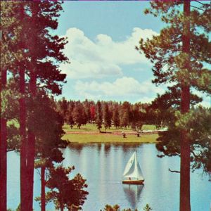
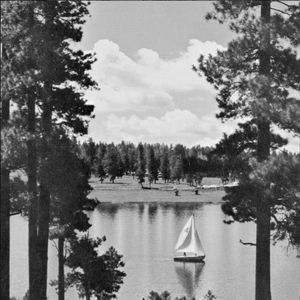
This will make the content inside all <div> elements on the page turn gray. Great for making your page look like a TV image from the 1940s!
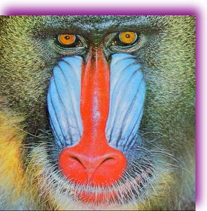
Original image (left); grayscale filtered image (right)


Most filters take some form of parameter to control how much filtering is done. So, for example, if you wanted to style your content to be halfway between the original color and a grayscale version, use the following code:
div { filter: grayscale(50%); }
Original image 50% gray filtered

If you want to apply a number of different filters one after another, it is easy — just place them one after the other in your CSS, like this:
div { filter: grayscale(100%) sepia(100%); }
This example will first make all the original color grayscale and then apply a sepia effect, and results in an image that looks like this:
Grayscale plus sepia

With the flexibility available for applying filters one after the other, all sorts of effects can be achieved — it's totally up to your imagination to experiment with creating amazing results.
What filter effects are available using CSS?
The original SVG filter mechanism is powerful but, at the same time, can be daunting to use. Because of that, CSS introduces a bunch of standard filter effects that make using them really easy.
Let's take a look at each of them and see what they do.
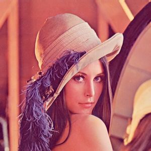
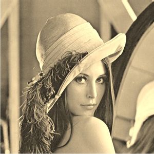
- grayscale(amount)
- This converts color in an input image to a shade of gray. The
amountcontrols how much gray conversion is applied. If set to 100% then all of the colors will be a shade of gray; if set to 0% the colors are unchanged. You can use a floating point number instead of percentages if you prefer; that is, 0 works the same as 0% whilst 1.0 produces the same result as 100%.
Original (left); grayscale 100% (right)
- sepia(amount)
- This gives the colors passed in a sepia tinge like in old photographs. The
amountapplied works in the same way as for thegrayscalefilter — namely 100% makes all the colors completely sepia toned and smaller values allow the effect to be applied in smaller proportions.
Original (left); sepia 100% (right)
- saturate(amount)
- This applies a saturation effect to the colors, which makes them look more vivid. It is a cool effect that can make photos look like posters or cartoons. This effect also allows you to use a value greater than 100% (the default) to really emphasize the saturation. This is an effect that can make things look pretty funky!
Original (left); saturate 1000% (right)
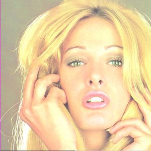
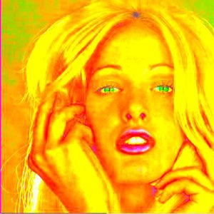
Note: In Chrome version 19 the saturate() filter takes an integer (without the percentage sign) instead of the decimal or percentage as defined in the W3C spec. Not to worry, this is a known bug that will be fixed soon, if it hasn't been already.
- hue-rotate(angle)
- This filter provides a color-geek effect that can be used for interesting results. It shifts the colors around to make an image look completely different. Imagine a color spectrum going from red to violet around a color wheel. This effect uses the original color on the wheel as input and rotates it by the
angleparameter to produce the output color value. This effect is applied throughout the image so that all the colors are shifted by the same amount on the wheel. This is a simplification of what actually occurs, but hopefully close enough to describe the resulting effect.
Original (left); hue-rotate 90 degrees (right)

- invert(amount)
- This effect flips the colors, so that if the
amountapplied is 100% the output looks like a photo negative from an old 35mm film camera! Using values smaller than 100% will progressively apply the invert effect.
Original (left); invert 100% (right)
- opacity(amount)
- If you want the content being filtered to look semi-transparent, use this effect. The 'amount' value defines how opaque the output will be. A value of 100% is completely opaque, so the output will be exactly the same as the input. As the value drops below 100% the output image becomes less opaque (more transparent) and you'll see less and less of it. This means that if the element overlaps other elements on the page, the content underneath will start to become visible. You can set the
amountto 0% and it will completely disappear — but note: the element still receives events (such as mouse clicks) that fire on completely transparent objects. This effect is useful for creating clickable areas without displaying the button. In general, the CSSopacityproperty isn't hardware accelerated, but some browsers that implement filters using hardware acceleration will accelerate the filter version of opacity to provide much better performance.
Original (left); opacity 50% (right)
- brightness(amount)
- This effect works like the brightness control on your TV. It adjusts the colors between completely black and the original color in proportion to the
amountparameter. If you set the amount to 0% you'll see nothing but black, but as the value increases toward 100% more and more of the original image brightens until you hit 100%, to match the input image. You can continue increasing the amount value — setting a value of 200% makes the image twice as bright as the original. This is useful when adjusting low light images.
Original (left); brightness 140% (right)

- contrast(amount)
- This is another control simular to a TV set. Use contrast to adjust the difference between the darkest and lightest parts of the input image. A setting of 0% results in black, similar to the
brightnesseffect, so it is not very interesting. However, as the value increases toward 100%, the difference in darkness (contrast) changes until you hit 100% and the original image is displayed again. If set above 100%, this effect increases the difference between light and dark colors even more profoundly.
Original (left); contrast 200% (right)
- blur(radius)
- To create a soft edge on content, add a blur. This effect looks like the classic Vaseline-on-a-sheet-of-glass look that was a popular cinematic technique. The blur effect smudges the colors together and spreads them out, to provide an out of focus appearance. The
radiusparameter affects how many pixels on the screen blend together. A larger value creates more blur. When set to 0%, the original image remains unchanged.
Original (left); blur 10px (right)

- drop-shadow(shadow)
- The
drop-shadoweffect makes content appear as though it is an object outside in the sun with a shadow falling on the ground behind it. The filter takes a snapshot of the image, converts it to a single color, blurs it, then offsets the result a bit to create a shadow of the original content. Theshadowparameter is more complicated than just a single value. For this effect, you enter a series of values separated by a space — and some of the values are optional. Theshadowvalues control where the shadow is placed (expressed as two measurements for x and y), how much blur is applied (another measurement), and the color of the shadow. For full details of these values, see the CSS Text Decoration specification, which definestext-shadowin great detail. The examples provided below highlight some of the possibilities.
Drop-shadow 16px 16px 20px black (left); drop-shadow 10px -16px 30px purple (right)
- This is another filter operation that is similar to existing CSS functionality available via the
box-shadowproperty. Using the filter approach means that it may be hardware accelerated by some browsers, as described in the section above on using theopacityfilter.
- url referencing SVG filters
- Because filters originated as part of SVG, it makes sense that you can style content using an SVG filter. This is easy with the current
filterproperty proposal. All filters in SVG are defined with anidattribute that can be used to reference the filter effect. To use any SVG filter via CSS, you can reference it using theurlsyntax. For example, the SVG markup for a filter could look like:<filter id=”foo”>...</filter>. Then, in the CSS, you could add a simple rule:div { filter: url(#foo); }to ensure the<div>content in your document is styled with the SVG filter definitions.
- custom (coming soon)
- Stay tuned to learn more about working with custom filters. Custom filters leverage the power of the computer's graphics GPU to use a special shading technique to perform amazing effects limited only by your imagination. This part of the
filterspecification is still in flux, but will start being supported by browsers in the near future.
Performance considerations
The performance of web pages and applications is always important when developing online content. CSS filters are a powerful tool for visual effects, but at the same time might impact the performance of a site.
It is important to determine how specific filters affect site performance, especially if your goal is to build sites that display as expected on mobile devices that support CSS filters.
Filters differ in how they run. Most filters will run quickly on any platform and have very minor performance impact. However, filters that include blurring, such as blur and drop-shadow, tend to be slower. This doesn't mean you shouldn't use them, but it is helpful to understanding how they work.
When you use a blur filter, it mixes the colors from pixels all around the output pixel to generate a blurred result. So, if your radius parameter is 2, then the filter uses 2 pixels in every direction around each output pixel to generate the mixed color. This process occurs for each output pixel, and the number of calculations grows exponentially as you increase the radius. Since blur reviews pixels in every direction, doubling the radius causes the filter to work with four times as many pixels, so it is four times slower each time you double the radius value. The drop-shadow filter uses blurring as part of its effect, so it too behaves just like blur when you adjust the radius and spread values of the shadow parameter.
On some platforms, it is possible to use the CPU to accelerate the blur filter, but that strategy may not be available in every targeted browser. Try experimenting with the radius value to create the effect you desire, and then reduce it as much as possible while still maintaining an acceptable visual effect. You can fine tune filter parameters to make the site experience better, especially when viewed on a mobile device.
If you're using URL-based filters that reference SVG filters, they can contain any arbitrary filter effect, so be aware that they may also slow down a site. Test filter effects and experiment by viewing the site on a mobile device to ensure the site performance is acceptable.
Other good resources
- Try using this awesome interactive abstract painting with filters application to experiment and share your artwork.
- Check out Eric Bidelman's excellent interactive filter page.
- Follow along with this great tutorial about filters that includes examples.
- Review the official W3C Filter Effects 1.0 draft specification.
- See this UI example created with filters.
Attributions
Portions of this content come from HTML5Rocks! article