Using CSS Regions to flow content through a layout
By Mike Sierra
Summary
The CSS Regions feature provides a way to implement complex magazine-style designs in which content flows through freely positioned layout elements. It allows you to dynamically flow content from one layout element to another, but does not specify how those elements are presented. For that, use whatever CSS technique is most appropriate: flexible boxes, multi-column layout, grid layout, floats, or even absolute positioning. This guide shows you how to flow text, but does not discuss these various layout techniques. See this page for the results, using one of the supporting browsers listed at the end of the article.
Arranging a layout
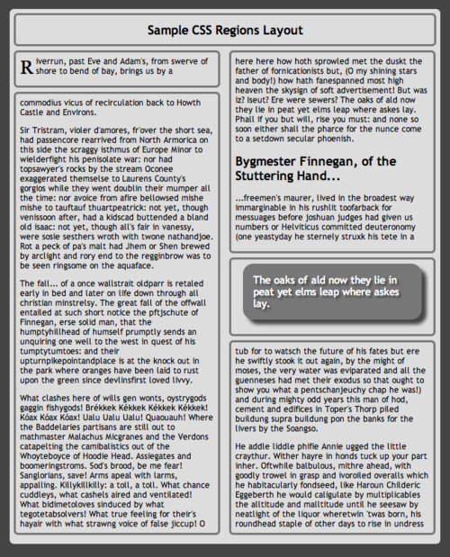
Before you flow text through a layout, you need to set up a layout. Here’s one that demonstrates various features of CSS regions:
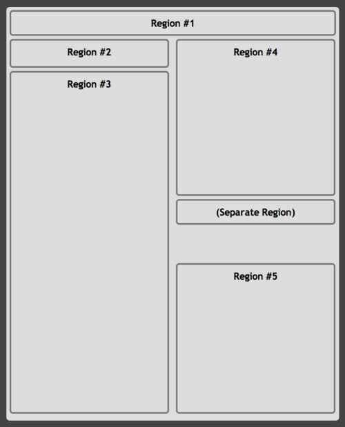
The HTML markup looks like this, and contains placeholder text indicating how the content is supposed to flow:
 <section class="page">
   <div id="title"> <h1>Region #1</h1>         </div>
   <div id="intro"> <h1>Region #2</h1>         </div>
   <div id="col1">  <h1>Region #3</h1>         </div>
   <div id="col2a"> <h1>Region #4</h1>         </div>
   <div id="pull">  <h1>(Separate Region)</h1> </div>
   <div id="col2b"> <h1>Region #5</h1>         </div>
 </section>
Here is the CSS for the layout, which for the sake of illustration uses a lot of absolute positioning and fixed heights, a fairly inflexible technique that’s generally not recommended:
section.page           { width: 8.5in; height: 11in; position: absolute; }
section.page > div     { border: #777 medium solid }
#title                 { height: 2.5em; }
#intro, #col1, #col2a, #col2b, #pull
                       { width: 45%; position: absolute; }
#intro, #col2a         { top: 5em; height: 3em; }
#col1                  { top: 10em; height: 52em; }
#col2a, #col2b, #pull  { left: 51%; }
#col2a                 { top: 5em; height: 23em; }
#col2b                 { top: 40em; height: 22em; }
#pull                  { top: 30em; height: auto; }
At this point, these layout elements are standard boxes that may contain their own independent content, but that will soon change.
Enabling a named flow
To flow text through a document, you need a set of layout elements as you see above, an element that contains content, and a pair of CSS properties to flow the content into the layout. In this example, the article tag contains the content, and the main set of numbered boxes provides the layout:
article {
    flow-into: main;
}
section.page > div:not(#pull) {
    flow-from: main;
}
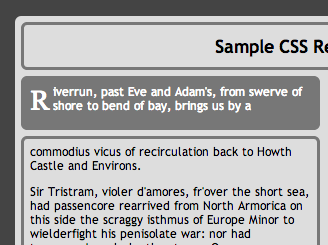
The flow-into and flow-from properties must both specify the same named flow for the feature to work, in this case main. Once that is in place, elements assigned with flow-from behave as regions that flow content. The series of regions through which content flows is called the region chain:
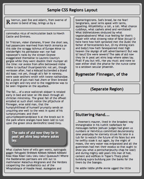
Notice the shaded box that interrupts the text, and the remaining short layout box that interrupts the subheading. As you will see below, these problems can be fixed.
How flows work
Flowing content into regions encourages you to keep semantic content elements separate from the presentational elements in which they appear. Even without a corresponding region chain in which to flow, applying flow-into makes the content element disappear from view, just as if you had assigned display:none. It reappears only when a corresponding flow-from is applied to presentational elements.
While defining regions dramatically changes how content appears in the document, it is implemented entirely as CSS, and does not affect the underlying content of DOM elements. In the example above, the innerHTML of the first div is still the Region #1 placeholder text.
Regions may be positioned arbitrarily around the screen, but content flows through regions strictly according to the order in which they appear in the document. In the HTML example above, there’s no way to shuffle regions #1 and #2 and make content follow the same order as labeled. Regions can be scattered across the document and interrupted by other flows’ regions or non-region elements, but the only way to modify their flow order is to rearrange them in the DOM tree.
You may also specify more than one source of content, in which case again their order within the document determines the order in which they flow. The example below flows content sources #1-3 into the same chain of regions. Rearranging the article nodes within the document shuffles their order within the output region:
 <style>
   article { flow-into: articles }
   div.region { flow-from: articles }
 </style>
 <article> source #1 </article>
 <article> source #2 </article>
 <article> source #3 </article>
 <div class="region"> </div>
Controlling region breaks
With content flowing through complex layouts, web developers need to confront design problems traditionally reserved for desktop publishing applications. While most of an article’s text can be allowed to flow from one region to another, some elements such as headings should not be allowed to break so freely:
Use the break-before, break-after, and break-inside properties to control how content is placed relative to region breaks. This CSS forces headings into a new region:
h1, h2, h3 {
    break-before: always;
}
In many cases, that approach may result in far too much white space within the previous region. This alternative approach keeps headings within a single region, and binds to subsequent content so that headings do not appear by themselves at the bottom of a region:
h1, h2, h3 {
    break-after  : avoid;
    break-inside : avoid;
}
Note that this sample layout mimics the appearance of print-style pages, but does not rely on any paged media features, so in this case you cannot use the various break properties to force content onto a new page rather than a new region.
Check your target browsers’ support for CSS3’s widows and orphans properties. They offer finer control over how many lines of text are allowed to break into another region. By default, individual lines may break into separate regions.
Diverting content from a flow
The various break properties shown above do not address a common layout problem. Sometimes content needs to be diverted from a flow and moved somewhere else so that other content can flow in to take its place. In this example, aside tags represent pull-quote content that needs to be diverted from the main flow:
 <article>
   <h1>    Sample CSS Regions Layout                                      </h1>
   <p>     Riverrun, past Eve and Adam's...                               </p>
   <p>     Sir Tristram, violer d'amores...                               </p>
   <p>     The fall... of a once wallstrait oldparr...                    </p>
   <aside> The oaks of ald now they lie in peat...                        </aside>
   <p>     What clashes here of wills gen wonts...                        </p>
   <h2>    Bygmester Finnegan, of the Stuttering Hand...                  </h2>
   <p>     ...freemen's maurer, lived in the broadest way immarginable... </p>
   <p>     He addle liddle phifie Annie...                                </p>
   ...
 </article>
Thankfully to address this problem, there can be more than one named flow in a document, and thus more than one series of regions. Defining a separate flow for the nested aside content removes it from the parent article content and allows it to be placed independently as part of a separate flow. This CSS diverts the pull-quote content:
/* main flow */
article {
    flow-into: main;
}
section.page > div {
    flow-from: main;
}

/* pullquote flow */
article > aside {
    flow-into: pullquote;
}
section.page > div#pull {
    flow-from: pullquote;
}
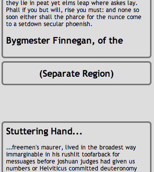
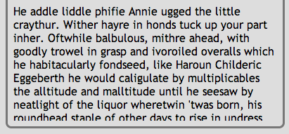
The pull-quote now appears in its own dedicated layout region, of which it is the only one in the chain:
In this case, the region’s height is specified as auto, which makes it expand vertically to accommodate the content that flows into it. This can be useful when designing flexbox-based layouts in which a more flexible column shrinks to accommodate neighboring content such as the pull-quote.
In this example, the parent article element is assigned to the main flow, while its child aside elements are assigned to a different flow named pullquote. You can use the same technique to assign descendant elements to the same flow, effectively un-nesting them from within content. In this example, endnotes are extracted from wherever they happen to appear within the main flow of content, and appear instead appended to the content, with no need to modify the content’s semantic structure:
 <style>
   article, aside.endnote { flow-into: main }
 </style>

 <article>
   ...
   <aside class="endnote">...</aside>
   ...
   <aside class="endnote">...</aside>
   ...
   <h2>Endnotes</h2>
 </article>
 <!-- endnotes appear here -->
However, descendant elements that are defined as the default flow-into:none cannot be prevented from flowing along with an ancestor that is assigned to a named flow.
Styling region fragments
Portions of content that break across regions are referred to as fragments. Using the @region rule, fragments of content that flow into specified regions can receive custom CSS styles.
In this example, only the portion of paragraph text that flows into the intro region has its text color inverted:
@region #intro {
    p {
        color          : #fff;
    }
}
To achieve the combined effect shown above, the region itself can specify its own styles. This CSS applies a different design to the intro element regardless of whether its flow-from specifies that it behaves as a region:
#intro {
    background-color   : #777;
}
While it is possible to style the region as a block element, CSS that is ordinarily inherited by child elements does not apply to content that flows into the region from elsewhere in the document. The content’s styling is still determined by standard CSS cascading and inheritance. So the following CSS does not work, and cannot be used as an alternative to the @region rule:
#intro {
    color : #fff;
}
Not all CSS properties can be manipulated in content that flows within a region. See @region for details.
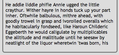
Trimming overset content
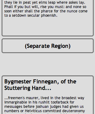
When flowing content through a layout, there may not be enough space available in the region chain to display all of it. In that case, the flow is in an overset state. By default, the last available region in the chain displays overset content according to its overflow setting. Still, even using overflow:hidden can lead to unfortunate visual artifacts along the bottom edge:
The region-fragment CSS property controls how content displays in this situation. Setting it to break causes the last overset region to display only the fragment of content that can fit within it, just as if subsequent content had been able to flow into another region:
div.region {
    region-fragment: break;
    /* overflow is irrelevant within regions when above is specified... */
    overflow: none;
}
This presents a much cleaner bottom edge on the overset region, and should be applied to region chains if the layout can get into an overset state:
Note: The CSS Regions feature offers API interfaces that can help detect when a flow’s content exceeds available layout regions, or falls short and leaves some of them empty. See the NamedFlow API’s overset and firstEmptyRegionIndex properties, as well as its regionoversetchange event.
Adaptive layouts with media queries
CSS media queries allow you to target different designs to browsers on differently sized devices. Such responsive web pages should target complex CSS region-based layouts only on larger-screen tablet or desktop browser interfaces. Mobile devices should rely on a much simpler one-column layout.
In the following example, large-screen browsers pour the article’s content into the section’s layout elements, using all the complex layout options described above. Small-screen browsers avoid the CSS Region feature altogether, suppressing the section element that would have displayed the complex layout, and also suppressing content elements (such as the pull-quote) that do not need to be presented within the simpler layout:
/* tablet & desktop browsers */
@media screen and (min-width: 480px){

    /* pour article into section */
    article            { flow-into : main; }
    section.page > div { flow-from : main; }

    /* custom flow for pull quotes */
    aside    { flow-into : pullquote; }
    div#pull { flow-from : pullquote; }

    /* @region rules can be nested within @media rules */
    @region #intro {
        p:first-of-type { color : #fff; }
    }
}

/* mobile browsers */
@media screen and (max-width: 480px){

    /* suppress layout based on CSS Regions */
    section.page { display : none; }

    /* suppress content inappropriate for mobile */
    aside { display : none; }

    /* style content simply for mobile */
    article {
        margin        : 1em 1em 10em 1em;
        padding       : 1em;
        border-radius : 1em;
        background    : #fff;
    }
    body {
        background    : #aaa;
        padding       : 0;
    }

    /* useful commentary */
    h1:first-of-type::after {
        display       : block;
        content       : " (but without the regions)";
    }
}
This produces an alternate mobile interface:
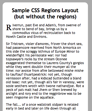
See this page for the results, using one of the supporting browsers listed below.
Where to go from here
Once you become accustomed to using regions, you can rely on a wide variety of techniques to customize layouts for your content. However, the more you want to set up rules to automate layout from various content sources, the more you should familiarize yourself with CSS3’s flexible box properties, which allow you to position layout elements fairly independently of how they are ordered within the DOM. Support for CSS Exclusions allows control over how content within some layout elements flows around others. Also familiarize yourself with the API interfaces that allow JavaScript applications to control how content flows.
See also
External resources
- W3C editor’s draft: CSS Regions Module Level 3
- Adobe Web Standards: CSS Regions
- Adobe Developer’s Network: CSS3 Regions: Rich page layout with HTML and CSS3
- Sample pages