SVG graphic effects
By Mike Sierra
Summary
This guide shows you how to embed images within SVG and apply various graphics effects such as gradients, patterns, clipping paths, and masks.
Gradients
SVG’s support for gradients is similar to CSS’s. Two kinds of gradient are available: the linearGradient and radialGradient elements. The fill property uses url() syntax to reference either kind:
<path id="tvScreen" fill="url(#tvScreenOff)" d="M159.957 184.103c-21.826 13.892-102.52 17.859-122.361 0c-19.843-17.857-22.486-83.999 0-99.873c22.489-15.874 104.504-17.858 122.361 0C177.814 102.088 181.783 170.214 159.957 184.103z"/>
This example transitions from a light to a dark gray from the top to the bottom of the shape:
<linearGradient id="tvScreenOff" x1="0" y1="0" x2="0" y2="1" >
    <stop offset="0" stop-color="#dddddd" />
    <stop offset="1" stop-color="#444444" />
</linearGradient>

In their simplest form, gradients require at least two nested stop elements to transition between their stop-color properties. The offset attribute specifies the progression of colors, either in percentage or corresponding decimal terms. That progression follows the line defined by the linearGradient element’s pair of x and y coordinates. If y1 were 1 in this example, the gradient would shift from the top left to the bottom right.
This example defines many more colors, progressing from bottom to top. Setting gradientUnits to userSpaceOnUse makes the x/y coordinates correspond to specific points within the graphic:
<linearGradient
   id            = "tvOn"
   x1            = "0"
   y1            = "200"
   x2            = "0"
   y2            = "70"
   gradientUnits = "userSpaceOnUse"
>
    <stop  offset="0"    stop-color="#F15A29" />
    <stop  offset="0.05" stop-color="#F15F29" />
    <stop  offset="0.17" stop-color="#F68D24" />
    <stop  offset="0.32" stop-color="#F9AC1C" />
    <stop  offset="0.42" stop-color="#FCBF13" />
    <stop  offset="0.5"  stop-color="#FDC70C" />
    <stop  offset="1"    stop-color="#1C75BC" />
</linearGradient>

Radial gradients emanate outwards from the center point by default, filling rectangular shapes elliptically. In this example, which generates an obscure cultural reference to an Iggy Pop song, the black color defined at the 30% mark is extrapolated towards the center at 0%:
<radialGradient id="tvEye">
  <stop offset="30%"  stop-color="black"     />
  <stop offset="32%"  stop-color="lightblue" />
  <stop offset="58%"  stop-color="lightblue" />
  <stop offset="60%"  stop-color="white"     />
  <stop offset="80%"  stop-color="white"     />
  <stop offset="100%" stop-color="pink"      />
</radialGradient>

The fx and fy attributes specify coordinates for the focus of the gradient, while cx and cy set the center of the outermost circle. Modifying the r (radius) effectively resizes the gradient, in this case magnifying it relative to the default 0.5 value:
<radialGradient id="tvRadial" cx="0.5" cy="0.5" fx="0.8" fy="0.5" r="0.6">

Patterns
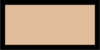
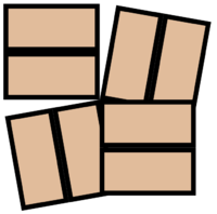
SVG’s patterns are similar to CSS’s repeating background images, but allow you more control over padding and reorienting patterns. To implement a pattern, you must first design a graphic. In this case, a rectangle fits within a 5×10 area along with a margin of 1 unit:
<rect id="tileRect" x="0.5" y="0.5" width="9.0" height="4.0" fill="#E1BC9B" />

The graphic is wrapped within a pattern element. Its width and height correspond to the intended size of tile. The x and y simply specify the pattern’s offset starting point.
<pattern
   id                    = "tilePattern"
   x                     = "0"
   y                     = "0"
   width                 = "10"
   height                = "5"
   patternContentUnits   = "userSpaceOnUse"
   patternUnits          = "userSpaceOnUse"
>
  <use xlink:href="#tileRect" />
</pattern>
The units attributes maintain the same fixed coordinate system as for the overall graphic, so that units are not interpreted as percentages of the filled object’s dimensions.
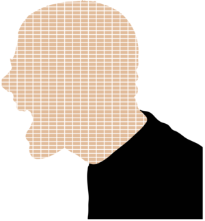
Use the fill property to apply the pattern, in this case to a complex path shape:
<path id="headShape" d="M468.054,306.428c0.118,0.623,0.557,0.974,1.042,1.325 ... "/>

<g id="graphic">
  <use xlink:href="#headShape" fill="url(#tilePattern)" />
  <use xlink:href="#shirtShape" />
</g>
Increasing the pattern’s width and height attributes allows you control over the tile’s margins:

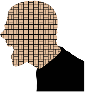
More complex tile patterns
This pattern consists of a very simple shape. You can make the pattern’s nested set of graphics as complex and varied as you want, or build larger patterns from smaller components. This example shows how to build series of alternating rotated tiles. First, modify the basic shape to include black around the margin:
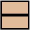
<g id="tileRect">
  <rect id="tileRectWhite" x="0"   y="0"   width="10"  height="5"   fill="#000000" />
  <rect id="tileRectBlack" x="0.5" y="0.5" width="9.0" height="4.0" fill="#E1BC9B" />
</g>
A tileSquare object duplicates the underlying graphic and uses a transform to move it below the original to form a 10×10 square:
<g id="tileSquare">
  <use xlink:href="#tileRect" />
  <use xlink:href="#tileRect" transform="translate(0,5)"/>
</g>
The square is then repeated four times within a larger 20×20 square:
<g id="tilePatternUnit">
  <use xlink:href="#tileSquare" />
  <g id="shiftDown" transform="translate(10,10) rotate(90)">
      <use xlink:href="#tileSquare"/>
  </g>
  <g id="shiftOver" transform="translate(10,10) rotate(-90)">
      <use xlink:href="#tileSquare"/>
  </g>
  <g id="shiftDownAndOver" transform="translate(10,10)">
    <use xlink:href="#tileSquare"/>
  </g>
</g>
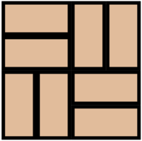
All the tiles except for the first one have transforms that move them to the bottom-right corner of the larger square. The second and third are rotated, pivoting around their top-left corners so that they occupy the other two corners. (Unlike CSS transforms, SVG transforms do not originate around the object’s center point.) Rotating by only 80 degrees may clarify how the transform works:
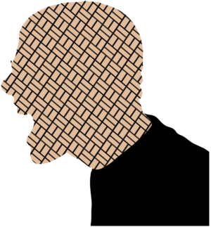
To apply the modified fill, reference the more complex object, and increase the pattern’s tiling area to accomodate it:
<pattern
   id                    = "tilePattern"
   x                     = "0"
   y                     = "0"
   width                 = "20"
   height                = "20"
   patternTransform      = "scale(1)"
   patternContentUnits   = "userSpaceOnUse"
   patternUnits          = "userSpaceOnUse"
>
  <use xlink:href="#tilePatternUnit" />
</pattern>

If the pattern is not sized appropriately for the shape, you do not have to resize the pattern’s dimensions or any of the component tiles. The example above specifies a patternTransform attribute with a scale(1) transform that leaves the size unchanged, but increasing the value to 1.5 magnifies the pattern:
Other transforms allow you to reorient and reshape the pattern. In this example, scale(1.5) skewY(15) rotate(30) boosts the pattern’s size, shears it slightly into a diamond shape, and spins it:
Clipping paths
Patterns are not necessarily for tiny images. By applying generous width and height pattern dimensions, you can also use them to display a single large graphic behind an irregular shape. Another way to do this is to apply a clipping path, which renders a graphic only inside the contours of another graphic.
Place a clipPath element around the shape you want to clip the graphic with, in this case the path we saw earlier that defines the television screen:
<clipPath id="screenClip">
    <use xlink:href="#tvScreen"/>
</clipPath>
When rendering the graphic to clip, use the clip-path property to reference the clipPath element:
<use xlink:href="#yeller" clip-path="url(#screenClip)" />
<g id="yeller">
  <use xlink:href="#headShape" fill="url(#tilePattern)" />
  <use xlink:href="#shirtShape" />
</g>

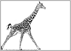
Adding images
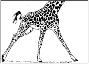
While SVG is designed for vector graphics, it can freely incorporate raster graphics via the image element. Use x and y attributes to position an image. Unlike HTML, you need to specify a width and height for an image to appear:
<image x="10" y="10" xlink:href="giraffe.png" width="270" height="297"
       preserveAspectRatio="xMidYMid meet"/>
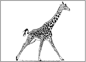
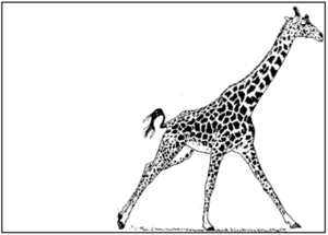
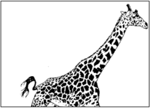
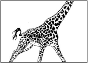
If the supplied dimensions don’t match the underlying data, various preserveAspectRatio options affect the image’s placement. The meet keyword fits the entire image, while slice clips it. To position the image, you can specify any combination of Min, Mid, and Max, which in the examples below match for each axis, but which you can mix arbitrarily. For example, xMidYMin aligns the image at the top, and centers it horizontally. Here are various ways to place a tall graphic in a wide image container:
xMinYMin meet
xMidYMid meet
xMaxYMax meet
xMinYMin slice
xMidYMid slice
xMaxYMax slice
Images scale depending on the current viewBox. For example, if the SVG importing the image appears within a viewport of 500×500 pixels (as specified by its own width and height), but its viewBox attribute specifies 0 0 1000 1000, then the image appears much smaller.
You can also use the image element to import SVG graphics:
<image xlink:href="face_components.svg#eyes" x="10" y="10" width="300" height="100"/>
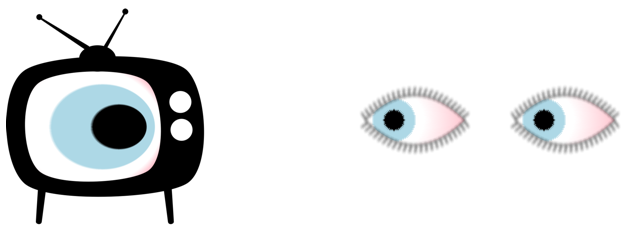
These externally referenced SVG components may animate, but they do not preserve any interactive features.
See also
Related articles
Filters
SVG graphic effects