SVG filters
By Mike Sierra
Summary
This guide shows you how to build SVG image processing filters to create interesting visual effects. It shows how to apply these effects within an SVG graphic, and how to apply them to HTML content using the filter CSS property.
The power of SVG filters is matched by the depth and complexity of available options. It takes a good deal of practice to master the many filter effects and understand how to combine them. This guide covers a wide range of examples. It starts by showing how to modify color values in ways that often correspond to built-in CSS filter functions. Then it shows you how to split and merge independent channels to take advantage of some of SVG’s more unusual filter effects. Finally, it shows you how to apply three-dimensional lighting effects.
What are filters?
A filter is a little machine that takes graphic input, changes it in some way, and causes the output to render differently. Filters comprise filter effect elements, some of which do intuitively obvious things (such as blur the graphic), and some of which only make sense when combined with other effects. Filter effects are often chained together so that one effect’s output becomes another effect’s input. Filter effects may also operate on different inputs that are modified independently of each other, then combined.
The idea of applying filters to web content originated in SVG, but it has recently been extended to CSS, so it helps to clarify what filter means in that context. CSS filters currently come in two flavors:
Built-in filter functions provide a series of fairly standard pre-built image processing effects, such as the blur() and grayscale() functions specified by the filter property. These CSS functions can be chained together to form larger effects. (Each is actually implemented as an SVG filter.) See Understanding CSS filter effects for a guide to these CSS functions.
In addition to standard two-dimensional image processing features, CSS custom filters allow you to warp the surface of an element in three dimensions using WebGL. Custom CSS filters are also known as shaders, either vertex shaders that warp a surface, or fragment shaders that modify the pixels that cover the resulting surface.
This guide does not discuss these more recent CSS custom filters, but does show you how to customize your own SVG filters for use in HTML.
Applying a simple filter (feGaussianBlur)
Start by placing some text within an SVG graphic:
<text class="blurred" x="30" y="100">An SVG Filter</text>

Place a filter element within the SVG’s defs region. Filters contain series of filter effect elements, all prefixed fe. In this example, a feGaussianBlur element produces a blurring effect, which matches the effect of the blur() CSS filter function:
<filter id="css_blur">
  <feGaussianBlur stdDeviation="10"/>
</filter>
To apply the filter, reference it with the filter property, expressed either as an attribute or via CSS:
<text
  class  = "blurred"
  filter = "url(#css_blur)"
  x      = "30"
  y      = "100"
>An SVG Filter</text>
.blurred {
    filter      : url(#css_blur);
    font-family : sans-serif;
    font-size   : 70px;
    fill        : red;
}

The effect takes each pixel and moves it around randomly from its original location within a radius specified by the stdDeviation value. Unlike the built-in CSS function, in SVG you can specify separate x and y values to produce a sideways motion effect that in this case is a bit more legible:
<filter id="sideways_blur">
  <feGaussianBlur stdDeviation="10 1"/>
</filter>

Applying SVG filters to HTML
If you want to apply this customized SVG filter to HTML content, place it in an SVG file and use the corresponding filter CSS property to reference it using the same url() function:
.sidewaysBlur {
    -webkit-filter : url(filters.svg#sideways_blur);
    filter         : url(filters.svg#sideways_blur); /* standard in Mozilla */
}
As of this writing, not all browsers allow you to apply SVG filters to HTML content. Mozilla Firefox fully supports the feature, even allowing filtered elements to animate. WebKit Safari’s support is limited to filters that use the blur described above, and basic image processing effects described in the first half of this guide: feComponentTransfer, feColorMatrix, and feConvolveMatrix.
Modifying colors with feComponentTransfer
The feComponentTransfer element allows you to modify each RGBA component represented in each pixel. Within the element, nest any combination of feFuncR, feFuncG, feFuncB, and feFuncA elements to run different types of function over each pixel component value.
Setting the type of function to identity is equivalent to leaving out the function element altogether, keeping the image on the left unchanged. Setting it to discrete allows you to posterize an image, clustering gradual color shifts into solid bands based on the step values specified in tableValues:
<filter id="no_op">
<feComponentTransfer>
  <feFuncR type="identity"/>
  <feFuncG type="identity"/>
  <feFuncB type="identity"/>
  <feFuncA type="identity"/>
</feComponentTransfer>
</filter>

<filter id="posterize">
  <feComponentTransfer>
    <feFuncR type="discrete"
        tableValues="0 0.2 0.4 0.6 0.8 1"/>
    <feFuncG type="discrete"
        tableValues="0 0.2 0.4 0.6 0.8 1"/>
    <feFuncB type="discrete"
        tableValues="0 0.2 0.4 0.6 0.8 1"/>
  </feComponentTransfer>
</filter>
Setting the type to linear multiplies the slope value (relative to the default 1), then adds an intercept value if present. The first example below reproduces the effect of the CSS brightness() function, flattening the slope to darken the image. The second increases the slope to brighten the image, but then drops all values by a fixed amount, zeroing out many of them:
<filter id="css_brightness">
<feComponentTransfer>
 <feFuncR type="linear" slope="0.5"/>
 <feFuncG type="linear" slope="0.5"/>
 <feFuncB type="linear" slope="0.5"/>
</feComponentTransfer>
</filter>

<filter id="brightness_threshold">
<feComponentTransfer>
 <feFuncR type="linear" slope="1.5" intercept="-0.3"/>
 <feFuncG type="linear" slope="1.5" intercept="-0.3"/>
 <feFuncB type="linear" slope="1.5" intercept="-0.3"/>
</feComponentTransfer>
</filter>

Setting the type to table lets you specify your own linear slope based on two tableValues. The first example behaves like the CSS opacity() function. The second, specifying a negative slope from 1 to 0, behaves like the CSS invert() function:
<filter id="css_opacity">
<feComponentTransfer>
<feFuncA type="table" tableValues="0 0.5"/>
</feComponentTransfer>
</filter>

<filter id="css_invert">
<feComponentTransfer>
  <feFuncR type="table" tableValues="1 0"/>
  <feFuncG type="table" tableValues="1 0"/>
  <feFuncB type="table" tableValues="1 0"/>
</feComponentTransfer>
</filter>
Setting the type to gamma allows you to perform gamma correction, a useful way to increase dark values. The function applies the following formula to produce a curve: ((amplitude × valueexponent) + offset). The first example heightens the darker greens, and the second uses offset to reduce the overall green level (the same way that intercept does for the linear type):
<filter id="gamma_correct">
<feComponentTransfer>
 <feFuncG type="gamma" amplitude="1" exponent="0.5"/>
</feComponentTransfer>
</filter>

<filter id="gamma_correct2">
<feComponentTransfer>
 <feFuncG type="gamma" amplitude="1" exponent="0.5"
          offset="-0.1"/>
</feComponentTransfer>
</filter>

Transforming colors with feColorMatrix
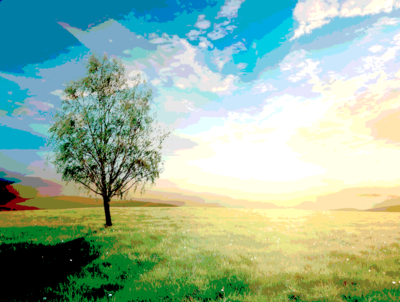
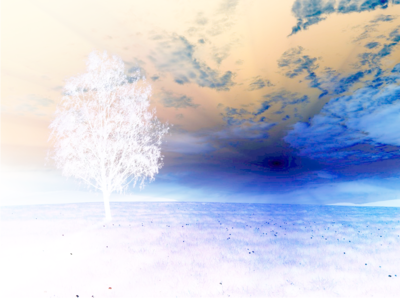
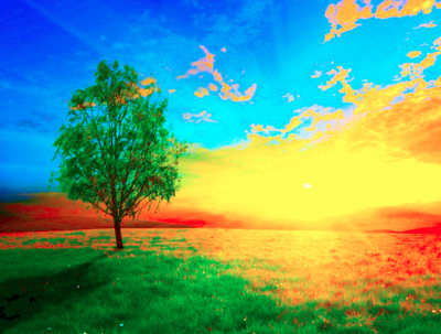
The feColorMatrix element provides other useful ways to modify an image’s color. With its type set to saturate, reducing the values from 1 produces a grayscale, while increasing it makes the image more vivid, just like the grayscale() and saturate() CSS functions:
<filter id="css_grayscale">
  <feColorMatrix type="saturate" values="0"/>
</filter>

<filter id="css_saturate">
  <feColorMatrix type="saturate" values="10"/>
</filter>
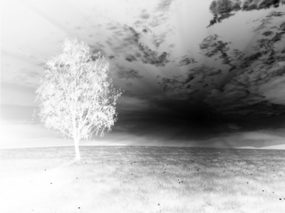
Setting the type to hueRotate alters the angle along the color wheel, just like the hue-rotate() CSS function. Setting luminanceToAlpha (no values necessary) produces an alpha channel from bright pixels, useful to produce image masks as described below.
<filter id="css_hue_rotate">
  <feColorMatrix type="hueRotate" values="180"/>
</filter>

<filter id="luminance_mask">
  <feColorMatrix type="luminanceToAlpha"/>
</filter>
As the name of the feColorMatrix suggests, setting the type to matrix allows you to transform colors yourself. It specifies a 20-element transform whose rows correspond to red, green, blue, and alpha channels. This initial transform leaves the image unchanged:
1 0 0 0 0
0 1 0 0 0
0 0 1 0 0
0 0 0 1 0
The first example below reproduces the effect of the CSS sepia() function, while the second simply reduces green and blue tones. (In these examples, the values appear stacked into a table only in the interest of clarity.)
<filter id="css_sepia">
  <feColorMatrix
    type="matrix"
    values=".343 .669 .119 0 0
            .249 .626 .130 0 0
            .172 .334 .111 0 0
            .000 .000 .000 1 0 "/>
</filter>

<filter id="dusk">
  <feColorMatrix
    type="matrix"
    values="1.0 0   0   0   0
            0   0.2 0   0   0
            0   0   0.2 0   0
            0   0   0   1.0 0 "/>
</filter>

Sharpening images with feConvolveMatrix
The feConvolveMatrix effect allows you to modify pixels based on the values of their neighbors, useful in sharpening details. In its simplest form, the order attribute declares a 3×3 box, which defines a matrix of 9 table values that must be reflected in the kernelMatrix attribute:
<filter id="no_op">
  <feConvolveMatrix order="3" kernelMatrix="0 0 0 0 1 0 0 0 0"/>
</filter>
The middle value is the pixel to modify, and the others form a map of its immediate neighbors:
0 0 0
0 1 0
0 0 0
The relative weight of the neighbors helps calculate the pixel’s new value. (In this case it’s 0 times each adjacent pixel’s value, summed together along with 1 times the value of the pixel, divided by the sum of all the pixel values.) This initial example has no effect on the image.
The original image shown on the left is slightly blurred. Applying a sharpen filter nudges pixels for the higher-contrast edges shown at the right:
 1  -1  1
-1  -1 -1
 1  -1  1


Getting convolve filters to behave predictably takes a bit of practice. The example on the left below sharpens the detail more dramatically, while the one on the right embosses it diagonally:
 1  -1    1
-1  -0.1 -1
 1  -1    1
9  0  0
0  1  0
0  0 -9
Convolution filters can also highlight moats around high-contrast edges. The more dramatic texture shown below on the right forms moats throughout the image. It requires an order of 5, which extends the range of the calculation to each adjacent neighbor’s farthest neighbor.
-1 -1 -1
-1  7 -1
-1 -1 -1
1   1   1   1  1
1  -2  -2  -2  1
1  -2  .01 -2  1
1  -2  -2  -2  1
1   1   1   1  1
As shown below, the example on the right is also converted to a grayscale using the luminanceToAlpha feColorMatrix effect described above, and the effect-chaining technique described in the following section.
<filter id="extremeEffect">
  <feConvolveMatrix order="5" kernelMatrix="1 1 1 1 1 1 -2 -2 -2 1 1  -2 .01 -2 1 1 -2 -2 -2 1 1 1 1 1 1"/>
  <feColorMatrix type="luminanceToAlpha"/>
</filter>
Chaining, splitting and merging effects: building a drop shadow with feOffset, feFlood, and feMerge
Much of the power of SVG filters comes from their ability to accept various graphic inputs, modify them independently of each other, then recombine them. This example reproduces the effect produced by the CSS drop-shadow() function. Stepping through each line and seeing the results as you go helps you to build far more interesting filters:
<filter id="css_drop_shadow">
  <feGaussianBlur stdDeviation="2"  in="SourceAlpha" />
  <feOffset dx="4" dy="6"           result="offsetblur"/>
  <feFlood flood-color="#777"/>
  <feComposite operator="in"        in2="offsetblur"/>
  <feMerge>
    <feMergeNode/>
    <feMergeNode                    in="SourceGraphic"/>
  </feMerge>
</filter>
First we start with an image transparency:
We’ve already seen the feGaussianBlur effect in action, but in this case it behaves differently. The optional in specifies the SourceAlpha, or all of its non-transparent pixels. The result of that effect, which is colored black, is passed to the next feOffset effect, which simply moves it down and over:

The feFlood effect simply produces a color, specified by its flood-color property. The effect is independent of the graphic we’ve produced so far, and doesn’t take any input from the offset effect, so it renders within the filter’s entire region:

By default, the result of the flood becomes the next effect’s in value, so neither of these attributes needs to be explicitly declared here. The feComposite effect applies the in composite operation on the portion of the gray fill that falls within the dropped shadow:

Finally, the feMerge effect combines the modified version of the graphic with the original. The first feMergeNode accepts the composite result by default, and the second specifies the SourceGraphic, which renders over it for the final effect:
Other input and merging options: feBlend, feComposite, feImage, feTile
The feMerge element shown above simply places one graphic over another to produce a new filter channel. As an alternative, you can use feBlend with its mode set to normal, which combines the in and in2 channels:
<feBlend in="SourceGraphic" in2="offsetBlur" mode="normal" />
The following shows how feBlend's other modes affect graphics that overlay each other. The lighten and darken modes simply take the lighter or darker of the two pixels:
normal
lighten
darken

screen
multiply
Setting the feComposite element’s operator to over produces the same default overlay as feMerge:
<feComposite in="SourceGraphic" in2="offsetBlur" operator="over" />
The following shows how its operators behave. The drop-shadow example above uses the in operator to fill a color within another graphic.
over
out
in
atop
xor
Setting the operator to arithmetic allows you to supply your own k1-k4 table values to produce composite blends. For example, set k1 and k4 to 0, then decrease k2 from 1 while increasing k3 from 0 for a cross-fade effect. This example makes the in2 graphic more visible:
<feComposite in="graphicA" in2="graphicB" operator="arithmetic" k1="0" k2="0.3" k3="0.7" k4="0"/>
Use the feImage element to import graphics into filter effects as in the examples above and below. It allows you to import not only raster images as with the image element, but any other SVG graphic as well. By default, graphics are placed in the center of the filter region. Otherwise, use x, y, width, and height attributes to reposition and resize them:
<feImage xlink:href="img/icon.png" x="100" y="50" width="20%" height="20%" result="icon"/>
<feImage xlink:href="#gradient" result="gradient"/>
<feTile/>
The feTile element simply allows you to repeat imported graphics as a pattern.
Warping effects (feMorphology, feTurbulence, feDisplacementMap)
The next example shows how to combine several filter effects to warp text:
<filter id="warp" >
  <feMorphology radius="3" operator="dilate"/>
  <feComponentTransfer>
    <feFuncR type="table" tableValues="1 0.5"/>
  </feComponentTransfer>
  <feMerge result="text">
    <feMergeNode/>
    <feMergeNode in="SourceGraphic"/>
  </feMerge>
  <feTurbulence type="fractalNoise" baseFrequency="0.017" numOctaves="1" result="warp" />
  <feDisplacementMap xChannelSelector="R" yChannelSelector="G" scale="60" in="text" in2="warp"  />
</filter>
Start with a bit of text:

The feMorphology effect specifies a dilate factor to thicken the graphic. (Alternately, erode would make it thinner.)

The feComponentTransfer modifies the color, as described in a previous section:

The feMerge places the modified outline behind the original letterform:

The feTurbulence effect produces its own graphic noise within which colors form cloud-like patterns:

The feDisplacementMap produces the final effect:

The displacement effect moves the pixels of the text (specified by in) based on the pixel values of the noise pattern (specified by in2). The xChannelSelector and yChannelSelector specify, for each axis, which color component’s value (R, G, B, or A) to use to push the pixels, and the scale sets the overall range of movement.
Creating textures (feTurbulence)
Turbulence is indispensable for grain and weave textures, useful for background patterns. Step through the following example:
<filter id="weave" x="0" y="0" width="100%" height="100%">
 <feTurbulence baseFrequency=".25,.03" numOctaves="3" seed="1"/>
 <feComponentTransfer result="grain">
   <feFuncR type="linear" slope="3"/>
 </feComponentTransfer>
 <feFlood flood-color="brown"/>
 <feMerge>
   <feMergeNode/>
   <feMergeNode in="grain"/>
 </feMerge>
</filter>
Supplying the feTurbulence effect with two baseFrequency values creates a striped effect:
An feComponentTransfer boosts the red values:
An feFlood provides a background color:

The final feMerge overlays the pattern:
Note the filter element in the example above uses x, y, width, and height attributes to specify dimensions. By default, filters operate on a region that’s somewhat wider than elements they are applied to, to account for offset effects such as the shadow shown above, which extends past the graphic’s original dimensions. In this example, the weave pattern only appears within the graphic’s original dimensions.
Lighting effects
Shining a light on a graphic provides additional depth and texture. To create a lighting effect, you need to specify three things:
A light color, specified by the lighting-color property
A light source, of which there are three kinds:
- a distant light (feDistantLight) is arbitrarily far away, and so is specified in terms of its angle from the target. This is the most appropriate way to represent sunlight.
- a point light (fePointLight) emanates from a specific point that is represented as a three-dimensional x/y/z coordinate. This is more appropriate when you need the perspective necessary to place a room light within a scene.
- a spot light (feSpotLight) behaves much like a point light, but its beam can be narrowed to a cone, and the light can pivot to other targets.
A basic type of light, of which two are available:
- diffuse light (feDiffuseLighting) indicates indirect light from an outside source.
- specular light (feSpecularLighting) specifies secondary light that bounced from reflective surfaces.
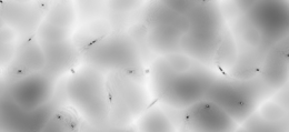
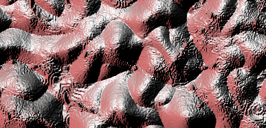
A graphic’s alpha channel forms a bump map that responds to light. Transparent values remain flat, while opaque values rise to form peaks that are illuminated more prominently. To illustrate how lighting works, this example generates a hilly terrain:
<filter id="terrain" x="0" y="0" width="100%" height="100%">
<feTurbulence baseFrequency=".01" numOctaves="2" seed="10" type="turbulence"/>
<feColorMatrix type="luminanceToAlpha"/>
<feComponentTransfer>
 <feFuncA type="table" tableValues="1 0"/>
</feComponentTransfer>
</filter>
The feTurbulence provides a noise pattern. The darker clusters will become hilltops, and the surrounding white areas will be valleys:
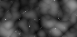
The feColorMatrix element’s luminanceToAlpha type converts the brighter colors in the valleys to higher alpha values:
The feComponentTransfer inverts the alpha channel, so that peaks have higher values and valleys have lower values:
To specify the lighting effect, nest the light source element (feDistantLight, fePointLight, feSpotLight) within the lighting type (feDiffuseLighting, feSpecularLighting). This example specifies a distant light:
<feDiffuseLighting lighting-color="brown" surfaceScale="100" diffuseConstant="1">
  <feDistantLight azimuth="0" elevation="20"/>
</feDiffuseLighting>
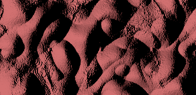
The distant light source’s azimuth corresponds to a compass angle along the horizon, which lies along the plane of the display screen. The elevation specifies the angle from the horizon, with 90° facing straight up, or out from the screen.
The diffuse lighting effect’s surfaceScale sets the maximum height of the hilltops. The diffuseConstant sets the light’s saturation, so increasing it from its default value of 1 produces sunlight that’s brighter than usual.
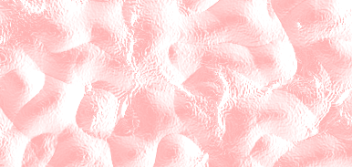
The corresponding specular lighting effect only produces highlights, which can be overlaid on the original scene:
<feSpecularLighting lighting-color="brown" surfaceScale="100" specularConstant="1">
  <feDistantLight azimuth="0" elevation="20" />
</feSpecularLighting>
This shows the two effects used in combination, with the lighting-color property specified separately in a style sheet. The two lighting effects take the same terrain input, then later composite the scene and its highlights:
.feDiffuseLighting,
.feSpecularLighting {
    lighting-color: brown;
}
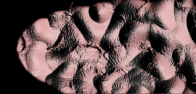
<filter x="0" y="0" width="100%" height="100%" id="shadow_terrain" primitiveUnits="objectBoundingBox">
<feTurbulence baseFrequency=".01" numOctaves="2" seed="1" type="turbulence"/>
<feColorMatrix type="luminanceToAlpha"/>
<feComponentTransfer result="terrain">
 <feFuncA type="table" tableValues="1 0"/>
</feComponentTransfer>
<feDiffuseLighting surfaceScale="100" in="terrain" result="scene">
  <feDistantLight azimuth="0" elevation="20"/>
</feDiffuseLighting>
<feSpecularLighting surfaceScale="100" in="terrain" result="highlights">
  <feDistantLight azimuth="90" elevation="20" />
</feSpecularLighting>
<feComposite in="scene" in2="highlights" operator="xor"/>
</filter>
Setting the filter’s primitiveUnits to objectBoundingBox allows you to specify light sources as relative percentages, otherwise the default userSpaceOnUse value references the coordinate system in effect when the filter was applied.
A point light allows you to place light sources closer to the scene. Specify a set of 3D coordinates to position the light source:
<fePointLight x="50%" y="50%" z="200">
A spot light can direct a beam from the light source to a different target defined by the pointsAtX, pointsAtY, and pointsAtZ coordinates. The limitingConeAngle attribute allows you to tightly focus the beam:
<feSpotLight x="0" y="100" z="150" pointsAtX="200" pointsAtY="100" pointsAtZ="0" limitingConeAngle="30"/>
See this animated SVG that repositions the light sources in these examples.
Beveling (feSpecularLighting)
Using lighting effects to bevel graphics adds a greater sense of depth to the drop-shadow effect seen above. Step through this example to build the effect:
<filter id="bevel" filterUnits="userSpaceOnUse">
  <feGaussianBlur in="SourceAlpha" stdDeviation="4" result="blur"/>
  <feOffset in="blur" dx="4" dy="4" result="offsetBlur"/>
  <feSpecularLighting surfaceScale="5" specularConstant=".75"
      specularExponent="20" lighting-color="#bbbbbb" in="blur"
      result="highlight">
    <fePointLight x="-5000" y="-10000" z="20000"/>
  </feSpecularLighting>
  <feComposite in="highlight" in2="SourceAlpha" operator="in" result="highlight"/>
  <feComposite in="SourceGraphic" in2="highlight" operator="arithmetic"
               k1="0" k2="1" k3="1" k4="0" result="highlightText"/>
  <feMerge>
    <feMergeNode in="offsetBlur"/>
    <feMergeNode in="highlightText"/>
  </feMerge>
</filter>
Start with some text that appears fairly indistinguishable against a filled background:

The blur pattern is piped to the feOffset and stored in offsetBlur for use as the drop shadow. It’s also stored in blur for use by the lighting effect:

The blur not only scatters pixels, but distributes their alpha values to form a rounded surface, which the lighting effect highlights:

The first feComposite clips the blurred edges that fall outside the graphic’s original contours, available as its SourceAlpha:

The second feComposite overlays the highlight with the original SourceGraphic:

Finally, the offsetBlur buffer is merged in to provide a drop shadow for additional depth and legibility:

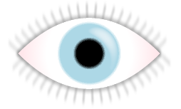
Use the same technique to add depth to surfaces, such as this example that defines a radial gradient that fades to transparent values:
<circle id="cornea" cx="100" cy="100" r="50" fill="url(#corneaSurface)"/>
<radialGradient id="corneaSurface">
  <stop offset="0%"   stop-color="black" stop-opacity="1"/>
  <stop offset="100%" stop-color="black" stop-opacity="0"/>
</radialGradient>

The filter uses feImage to import an graphic filled with the gradient, then shines a narrow spot light on the surface, which results in a subtle rounded highlight:
<filter id="corneaShine" primitiveUnits="objectBoundingBox" >
  <feImage xlink:href="#cornea"/>
  <feSpecularLighting lighting-color="white" surfaceScale="170" specularConstant="2" result="shine">
    <feSpotLight x="200" y="-100" z="200" pointsAtX="120" pointsAtY="80" pointsAtZ="50" limitingConeAngle="7"/>
  </feSpecularLighting>
  <feComposite in="shine" in2="SourceGraphic" operator="over"/>
</filter>
See also
Related articles
Filters
SVG filters
External resources
- SVG Essentials: Filters, by J. David Eisenberg
- An SVG Primer for Today’s Browsers, by David Dailey
- Scalable Vector Graphics 1.1, Second Edition
- Hands On: SVG Filter Effects