SVG animation
By Mike Sierra
Summary
This guide shows you how to animate SVG graphics using SMIL-based markup. Along with core animation techniques, it shows how to morph shapes, move graphics along curved paths, animate complex filter effects, and control animations from JavaScript.
Introduction
Interfaces become more vibrant when you add animation effects. This guide focuses on SVG’s built-in animation features, which derive from the SMIL web standard (Synchronized Multimedia Integration Language). As discussed in the SVG grand tour, many SVG attributes are actually implemented as CSS properties, and thus respond to CSS transitions and keyframe animations. The techniques described here offer a way to smoothly animate SVG attributes. You’ll also learn how to dynamically modify those attribute values that can’t be animated.
A simple animation
Start with a simple SVG element that you’d like to animate:
<text x="0" y="100">An SVG Animation</text>
Nest an animate element such as the following:
<text x="0" y="100">
    An SVG Animation
    <animate
        attributeName = "x"
        from          = "1000"
        to            = "0"
        begin         = "0s"
        dur           = "0.5s"
        id            = "swipe"
    />
</text>
When you load the SVG, the resulting animation quickly swipes in some text from the right side of the screen:
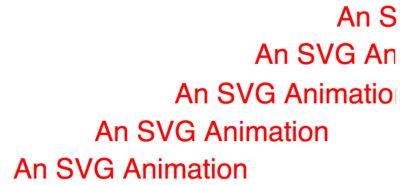
Each animation element can modify the value of only one attribute at a time, specified by the attributeName. The from and to set what the values of that attribute should be at the beginning and end of the animation. Setting the begin to 0s makes it execute immediately, and the dur sets a half-second duration over which the animation executes.
Instead of nesting the animation, you can also indirectly link the element you want to animate:
<defs>
<animate xlink:href="#swipeText" id="swipe" attributeName="x"
         from="1000" to="0" begin="0s" dur="0.5s" />
</defs>
<text id="swipeText" x="0" y="100">An SVG Animation</text>
Delaying an animation
Increasing the begin attribute’s time value from 0s to 1s delays the animation:
<text x="1000" y="100">
    An SVG Animation
    <animate
        attributeName = "x"
        from          = "1000"
        to            = "0"
        begin         = "1s"
        dur           = "0.5s"
        fill          = "freeze"
        id            = "delayed_swipe"
    />
</text>
Delaying the animation causes a problem, and the solution is highlighted. The outer text element’s x attribute is set to 1000. If it were to start at 0, the text would display for a second, then awkwardly disappear once the animation starts to execute, slide in from the right, and reposition itself at its initial location.
Fixing that problem causes another problem, whose solution is also highlighted. Once the animation completes, by default the value of x reverts to its initial value, 1000, thus making it disappear. Setting the fill attribute to freeze maintains the attribute’s value after the animation completes, effectively overriding whatever the text element specifies. (The fill attribute used in animations is unfortunately named the same as SVG’s fill property, which specifies background colors and images. Do not confuse the two.)
Sequences of frames
The animation above swipes in, but then comes to an abrupt stop. This variation bounces the text a bit off the left wall:
<animate
    id            = "bounce"
    attributeName = "x"
    from          = "1000"
    to            = "0"
    begin         = "0s"
    dur           = "0.5s"
    fill          = "freeze"
    values        = "1000;0;-20;10;0"
    keyTimes      = "0;0.8;0.85;0.9;1"
/>
The highlighted values attribute uses semicolons to specify a series of intermediate values between the animation’s begin and end points. Starting at 1000, the animation proceeds to the 0 point that represents the left wall, then goes a bit further to -20, then back to 10 before finally settling at 0.
By itself, the values specification would still result in an awkward-looking animation. The initial transition between 1000 and 0 executes very quickly, compared to which the subsequent transitions seem much too slow. The keyTimes fixes this by specifying milestones between 0 and 1 at which each frame appears. In this case, the initial transition that slides the text in takes 80% of the total duration, rather than the more brisk 25% default range between the five values. The number of keyTimes must match the number of values, or the animation does not work.
Synchronizing animations
The example above manipulates a simple positioning attribute. Animations become far more interesting when applied to complex filter effects, which are discussed in SVG Filters. This variation synchronizes two different animations, swiping horizontally blurred text into view, then removing the blur once it has stopped:
It is based on the following filter:
<filter id="slidingBlur">
  <feOffset       id="slideEffect" dx="1000" dy="0" />
  <feGaussianBlur id="blurEffect" stdDeviation="20,1" />
</filter>
The feOffset effect’s dx value reproduces the slide effect using the techniques discussed above, moving the element horizontally within the filtered region:
<animate
    id            = "slideAnim"
    attributeName = "dx"
    from          = "1000"
    to            = "0"
    begin         = "0s"
    dur           = "0.5s"
    fill          = "freeze"
    values        = "1000;0;-20;10;0"
    keyTimes      = "0;0.8;0.85;0.9;1"
    xlink:href    = "#slideEffect"
/>
The feGaussianBlur effect’s stdDeviation controls the degree of blur, which the animation reduces primarily along the x axis. But note its begin attribute no longer specifies a time value. Instead, this animation begins whenever the previous one ends:
<animate
    id            = "blurAnim"
    attributeName = "stdDeviation"
    from          = "20,1"
    to            = "0,0"
    begin         = "slideAnim.end"
    dur           = "0.2s"
    fill          = "freeze"
    xlink:href    = "#blurEffect"
/>
The slideAnim identifies the previous animation, and the .end refers to the end DOM event the animation produces. You can also reference the corresponding begin event to execute different animations concurrently, without having to keep track of how long each one takes to keep them all synchronized.
To calculate when to start the second animation, SVG actually looks ahead to see when the end event is supposed to occur, based on the specified duration. You can subtract or add time values to start it before or after that point. For example, this variation overlaps the two animations by a fifth of a second:
begin = "slideAnim.end-200ms"
To maintain long chains of animations, you can also use the prev shorthand keyword, which refers to the previously defined animation:
begin = "prev.end"
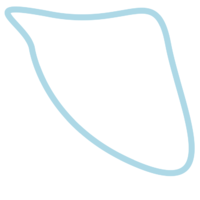
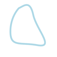
Morphing shapes
The motion animation shown above animates a single value at a time, but the blur animation animates two, a pair of x/y coordinates. SVG also allows you to animate long series of coordinates that make up path definitions, which are discussed in SVG basic shapes and text. This results in curved morphing effects:
For the animation to work, the from and to values, and any frames specified along the way in values, must feature the exact same number of path commands, all arranged in the same sequence. Only their numeric values may vary. This example shows a path consisting of one M positioning command and four S curve commands going through a series of eight frames:
<path id = "shape" d = "M 115,169 S 149,424 460,555 S 608,367 568,157
      S 438,108 174,57 S 97,90 115,169" >
<animate attributeName = "d" begin = "0s" dur = "20s"
  from = "M 115,169 S 149,424 460,555 S 608,367 568,157 S 438,108 174,57 S 97,90 115,169"
  to = "M 115,169 S 149,424 460,555 S 608,367 568,157 S 438,108 174,57 S 97,90 115,169"
  values = "M 115,169 S 149,424 460,555 S 608,367 568,157 S 438,108 174,57 S 97,90 115,169;M
    284,81 S 117,248 91 ,478 S 240,595 547,608 S 608,349 588,140 S 420,48 284,81;M
    360,313 S 413,253 475,308 S 491,422 464,508 S 293,511 217,424 S 254,297 360,313;M
    381,643 S 574,490 580,225 S 468,133 297,38 S 103,144 62,382 S 172,641 381,643;M
    456,56 S 579,221 603,479 S 449,59 5 196,636 S 64,367 96,111 S 371,28 456,56;M
    552,89 S 326,83 111,219 S 66,407 104,623 S 426,653 605,503 S 655,263 552,89;M
    628,3 55 S 563,183 397,79 S 199,79 65,270 S 65,464 258,650 S 467,623 628,355;M
    84,239 S 223,528 336,620 S 516,606 630,347 S 587,153 3 25,70 S 76,87 84,239;M
    115,169 S 149,424 460,555 S 608,367 568,157 S 438,108 174,57 S 97,90 115,169"
/>
</path>
Setting the pace
This variation on the swipe animation doesn’t bounce the text against the wall, but instead brings it to a more gradual stop:
<animate
    id            = "ease_in"
    attributeName = "x"
    from          = "1000"
    to            = "0"
    begin         = "1s"
    dur           = "0.5s"
    fill          = "freeze"
    calcMode      = "spline"
    keySplines    = "0 0.75 0.25 1"
    keyTimes      = "0;1"
/>
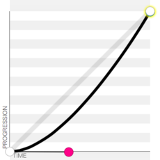
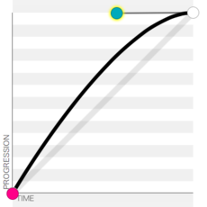
By default, animations proceed instantly and progress as a constant rate. Setting the calcMode to spline allows it to start and stop more gradually. The accompanying keySplines defines a bezier response curve. (Use semicolons to specify as many curves as there are frames in your animation.)
The following examples show how these response curves behave, usually by slowing the start and end points. Each x axis represents the animation’s elapsed time, and the y axis represents its progress, so the more the line curves vertically along the way, the faster the animation proceeds at that point:
0.42 0 1 1
ease-in
0 0 0.58 1
ease-out
0.25 0.1 0.25 1
ease
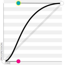
0.42 0 0.58 1
ease-in-out
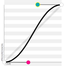
0 0 1 1
linear
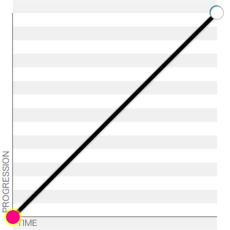
These examples compare common transition-timing-function and animation-timing-function CSS property keywords with their cubic-bezier() CSS function equivalents, which matches SVG’s keySplines.
If calcMode is set to discrete, the animation jumps abruptly from each frame defined in values to the next, just like CSS’s steps() function. If it’s set to paced, it progresses at a constant rate over the entire course of the animation, but unlike linear, it ignores any progress points keyTimes may define along the way.
Repetition
The examples above all execute once, but this example uses repeatCount to run an animation continuously. It modifies a more complex filter effect (explained in greater detail in SVG Filters) that shines a light on a beveled surface:
<filter id="bevel" filterUnits="userSpaceOnUse">
  <feGaussianBlur in="SourceAlpha" stdDeviation="4" result="blur"/>
  <feOffset in="blur" dx="4" dy="4" result="offsetBlur"/>
  <feSpecularLighting id="elevationEffect" surfaceScale="20" specularConstant=".75"
        in="blur" result="specOut" specularExponent="20" lighting-color="#bbbbbb" >
    <feDistantLight id="lightAngleEffect" azimuth="0" elevation="30" />
  </feSpecularLighting>
  <feComposite in="specOut" in2="SourceAlpha" operator="in" result="specOut"/>
  <feComposite in="SourceGraphic" in2="specOut" operator="arithmetic" result="litPaint"
        k1="0" k2="1" k3="1" k4="0" />
  <feComposite in="litPaint" in2="offsetBlur" operator="over"/>
</filter>

One animation highlights different sides of the element by rotating the light source around it, using its azimuth attribute to modify direction. Its repeatCount is set to indefinite, so after it proceeds from 0 to 360 degrees, it restarts invisibly at 0:
<animate
    id            = "lightAngleAnim"
    attributeName = "azimuth"
    from          = "0"
    to            = "360"
    begin         = "0s"
    dur           = "7s"
    repeatCount   = "indefinite"
    xlink:href    = "#lightAngleEffect"
/>
A second un-synchronized animation raises and lowers the rounded surface that makes the element appear beveled. Unlike the previous animation, the from and to values match, and the oscillation occurs within the intervening frames defined in the values attribute. (Unlike CSS keyframe animations, SVG does not allow you to oscillate between the start and end values each time the animation repeats.)
<animate
    id            = "elevationAnim"
    attributeName = "surfaceScale"
    from          = "5"
    to            = "5"
    begin         = "0s"
    dur           = "5s"
    values        = "5;20;5"
    repeatCount   = "indefinite"
    xlink:href    = "#elevationEffect"
/>
(Yet another animation synchronizes with the first, repositioning the shadow set by feOffset to match the angle of the light source.)
-
- **Note:** As of this writing, only Firefox displays these animations in HTML content via the [**filter**](/css/properties/filter) CSS property. See [SVG Filters](/svg/tutorials/smarter_svg_filters) for more information on how to do this. However, there is no clear way to restart these animations when re-applying the filter in the HTML, so it is more appropriate for animations that execute continuously. As a workaround within SVG, toggle CSS classes to apply filters, then use a DOM mutation event such as **begin = "targetID.DOMAttrModified"** to restart the animation.
begin = "otherAnim.repeat"
begin = "otherAnim.repeat(1)"
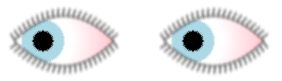
Each animation defines a potentially expansive length of time, over which you can repeat an animation using a series of begin values. For example, the eyeballs discussed in the SVG grand tour blink several times in a row, leaving long pauses between each iteration:
begin = "4s;6s;8s;9s;11.5s;13s"
Read on for information on how to trigger animations from JavaScript.
Building progressions
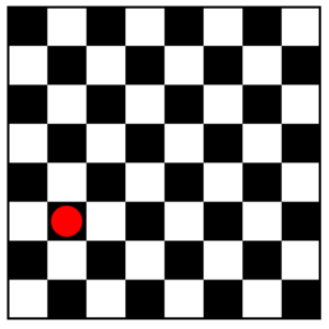
In all of these examples, the from and to are fixed at specific values. Sometimes it’s useful to build on a value that results from a previous animation. Here’s an example that moves a piece across an checker board:
<rect id="board" x="0" y="0" width="800" height="800" stroke="#000" stroke-width="6" fill="url(#chessBoard)"/>
<circle id="piece" fill="red" cx="150" cy="550" r="40"/>
The board is defined as an 800×800 square, and the piece is positioned over one of those squares. (See SVG graphic effects for information on how to use transforms and patterns to build a checker board.) The accompanying animation moves the piece three squares over to the right:
<animate
    id            = "moveRight"
    attributeName = "cx"
    from          = "0"
    to            = "100"
    values        = "0;100;100"
    keyTimes      = "0;.7;1"
    begin         = "piece.click"
    dur           = "0.5s"
    fill          = "freeze"
    repeatCount   = "3"
    additive      = "sum"
    accumulate    = "sum"
    xlink:href    = "#piece"
    restart       = "whenNotActive"
/>
When you set the additive attribute to sum, the from and to values are interpreted in terms relative to the element’s original value. In this case, the circle’s cx is 150, so the animation starts there and ends at that value plus 100, resulting in 250.
When you set the accumulate attribute to sum, each of the animation’s repetitions builds upon the previous value. In this case, it proceeds from 150 to 250, 350, then 450.
Notice also that the begin does not specify a time value, but instead responds when users click on the piece. SVG supports interactive mouse, focus, and DOM mutation events. To prevent problems resulting from such interaction, setting the animation’s restart attribute to whenNotActive prevents it from restarting if it is already executing.
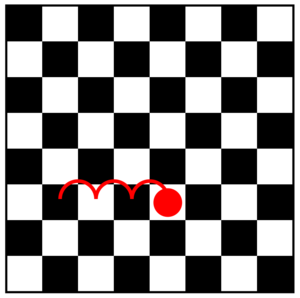
Curved motions
The example above moves the game piece in a straight line, but instead you can move it along the curve of a path. SVG provides an alternative animateMotion element, whose path attribute specifies the movement of a graphic relative to its current position. The animation also links to the graphic that is to be moved along that path. This example moves the game piece along the highlighted series of arcs, exactly as shown. It relies on the A path command to define elliptical semicircle curves to destination points up and to the right.
<defs>
<animateMotion
    id         = "animDiag"
    xlink:href = "#piece"
    begin      = "piece.click"
    fill       = "freeze"
    dur        = "3s"
    path       = "M 0,0 A 1,1 0 0 1 100,-100 A 1,1 0 0 1 200,-200 A 1,1 0 0 1 300,-300"
/>
</defs>
<rect id="board" x="0" y="0" width="800" height="800" stroke="#000" stroke-width="6" fill="url(#chessBoard)"/>
<circle id="piece" fill="red" cx="150" cy="550" r="40"/>
As an alternative, nesting an mpath element within the animateMotion makes the graphic travel along the contours of any referenced path, rather than relative to the current position. This example makes an icon travel continuously around an irregularly curved shape. The direction of movement depends on the sequence of path commands, in this case a counter-clockwise motion:
<defs>
<animateMotion
    xlink:href  = "#icon"
    rotate      = "auto"
    start       = "0s"
    dur         = "10s"
    repeatCount = "indefinite"
>
    <mpath xlink:href="#shape"/>
</animateMotion>
</defs>
<image id="icon" x="0" y="0" width="50" height="50" xlink:href="icon.png"/>
<path id="shape" d="M 115,169 S 149,424 460,555 S 608,367 568,157 S 438,108 174,57 S 97,90 115,169"/>
By default, the graphic retains its original orientation, as shown below on the left where the icon points right. Specifying a rotate attribute of auto keeps it pointed in the direction of travel. A value of auto-reverse makes the left side of graphic face forwards, and on the other side of the path.
rotate="0" (default)
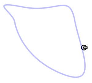
rotate="auto"
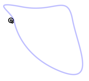
rotate="auto-reverse"
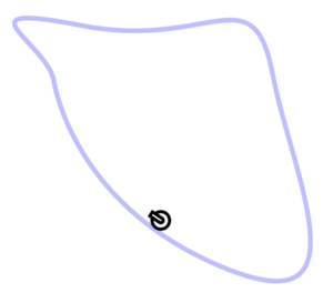
View this animation. The example additionally morphs the shape along which the icon travels.
To move text along a path, you need to return to the animate element, modifying the textPath's startOffset attribute, which sets the text’s starting point relative to the start of the path. In this example, both offsets place the text out of view. Ordinarily you can specify percentages as offset values, but these units are defined relative to an arbitrary pathLength value, which helps to pace the animation regardless of the path’s actual length:
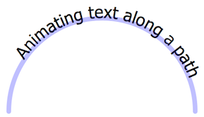
<defs>
<animate
   xlink:href    = "#txtPath"
   attributeName = "startOffset"
   from          = "1000"
   to            = "-1000"
   start         = "0s"
   dur           = "8s"
   repeatCount   = "indefinite"
/>
</defs>
<text id="txt">
  <textPath id="txtPath" xlink:href="#shape" startOffset="0">
    Moving text along a path
  </textPath>
</text>
<path
   id         = "shape"
   d          = "M 100,300 A 1,1 0 0 1 500,300"
   pathLength = "1000"
   />
Animating transforms
Transforms specify not just a single value, but a combination of functional values. To animate them, use the specialized animateTransform element, which clarifies which transform function you want to animate. It works just like the animate element, but the additional type attribute specifies the transform function to be animated. This example moves a graphic diagonally:
<animateTransform
   attributeName = "transform"
   type          = "translate"
   from          = "0,0"
   to            = "10,10"
   begin         = "0s"
   dur           = "1s"
   xlink:href    = "#shiftDiagonal"
/>
The element to be animated must not specify other transforms. For example, if you want to animate the rotate() function shown on the left below, you need to place the accompanying translate() in a different element as shown on the right:
<g transform="translate(10,10) rotate(-90)">
  <use xlink:href="#tileSquare" />
</g>
<g transform="translate(10,10)">
  <g id="pivot" transform="rotate(-90)">
    <use xlink:href="#tileSquare" />
  </g>
</g>
View this animation for an example of transforms within a pattern tile. As of this writing, animating transforms on entire patterns (using patternTransform) does not work reliably in many browsers.
Color properties and other values
To animate color values, SVG provides another specialized animateColor element. In this example, its attributeType may help clarify that the animation is modifying a CSS property, rather than an XML attribute assumed as the default:
<animateColor
   attributeName = "fill"
   attributeType = "CSS"
   from          = "#E1BC9B"
   to            = "#996600"
   fill          = "freeze"
   begin         = "0s"
   dur           = "5s"
   xlink:href    = "#tileRectSkin"
   id            = "animSkinColor"
/>
However, note that SVG color values are implemented as CSS properties, which may be animated more easily using CSS-based animation techniques. For example, toggling classes might transition the skin color in the example above:
body {
    transition         : all 1s;
    -webkit-transition : all 1s;
    -moz-transition    : all 1s;
}
.white { fill: #E1BC9B }
.black { fill: #996600 }
(The SVG grand tour discusses how to apply CSS properties to use instances, which are necessary for more complex graphics.)
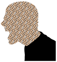
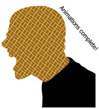
Many SVG attributes and properties that specify arbitrary string values cannot be animated at all, but you can still dynamically modify them using the set shorthand element. It can be triggered like any animation, but executes immediately on any value. In this example, a tref element draws in text from a label1 object, which the set replaces with label2 to display different text once a separate animation has completed:
<defs>
<set
   attributeName = "xlink:href"
   xlink:href    = "#label"
   to            = "#label2"
   begin         = "animSkinColor.end"
/>
<text id="label1">Animation in progress...</text>
<text id="label2">Animation complete!</text>
</defs>
<text x="10" y="10" transform="translate(170,10) rotate(50)">
  <tref id="label" xlink:href="#label1"/>
</text>
View these combined animations
Scripting animations
This guide shows various ways to control SVG animations, and suggests opportunities to pair them with CSS animations. To wrap up, this section shows how an application might control them with JavaScript. To play back an animation, call beginElement() on the relevant animation element:
function play() {
    document.querySelector('animate').beginElement();
}
SVG documents keep track of the number of seconds they have been running, available via the root svg element’s getCurrentTime() method. If an animation is set to begin at 0s, it executes when the SVG loads. Calling beginElement() restarts the clock for the specified animation.
Calling endElement() stops a currently running animation, returning the graphic back to its original position, or halting it if the animation’s fill attribute is set to freeze. Both of these methods are equivalent to running beginElementAt(0) or endElementAt(0). Any other time value specifies a delay: beginElementAt(2) starts an animation after two seconds, and endElementAt(2) waits the same amount of time before stopping it.
SVG also provides a mechanism to pause and resume playback, but it applies to all animations that are currently running. The following toggles playback:
function pausePlayAll() {
    var root = document.querySelector('svg');
    root.animationsPaused()
        ? root.unpauseAnimations()
        : root.pauseAnimations();
}
Note that animationsPaused() is a method call just like pauseAnimations() and unpauseAnimations(), not a simple object property as you might expect.