Styling HTML tables
Summary
This article provides a guide to the fundamental styling options available for tables.
Introduction
At times it seems that tables are a little misunderstood in modern web development. So much attention is given to “don’t use tables!” that people sometimes forget the issue is actually "don’t use tables for layout". Tables are excellent for their true purpose — displaying tabular data. So it makes sense to know how to style them properly.
This article focuses on applying CSS in an efficient manner, to produce clear and readable data table styles. We’ll also cover some common design requests for tables.
Table structure
Before we dive into the CSS, let’s consider the key structural elements of tables you will need to style clearly:
- Table headings
- Table data cells
- Table captions
When your site users read your table, they should be able to easily understand and follow the structure of the table. The most common way to do this is with borders, background colours, or both.
You do not have to follow these style conventions, however, you should ensure that there is some clear difference between th and td cells; also, the caption should be clearly associated with the table and differentiated from other text on the page.
The basics
Consider the way this unstyled table is rendered (this is the same example you met in HTML tables):
| Volcano Name | Location | Last Major Eruption | Type of Eruption |
|---|---|---|---|
| Compiled in 2008 by Ms Jen | |||
| Mt. Lassen | California | 1914-17 | Explosive Eruption |
| Mt. Hood | Oregon | 1790s | Pyroclastic flows and Mudflows |
| Mt. St. Helens | Washington | 1980 | Explosive Eruption |
Table and cell width
The first decision is how wide to make the table. The browser default is the same as setting table { width: auto; }, which results in the table extending to the width of the content. This generally looks untidy.
Let’s imagine that our table is going into a content column 600px wide. Let’s set the table to expand to 100% of the available width, to make best use of space. Since there are four columns, let’s also set the width of the table cells to an equal 25% each:
table {
  width: 100%;
}

th, td {
  width: 25%;
}
You can actually just set the width on th and it will set the width of all the columns; however, it doesn’t hurt to be thorough. This simple style will produce the result seen in Figure 1:
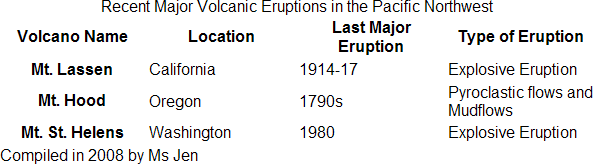
Figure 1: The example table with simple width settings.
The cells are now sitting at an even width. We’ll look at setting uneven widths later, but for now let’s push on.
Text alignment
The table is still a bit confusing to read, so let’s set up the text alignment to be a little neater — the additional rule below will left-align the headers to match the content (by default, browsers centre table headings):
table {
  width: 100%;
}

th, td {
  width: 25%;
  text-align: left;
}
This neatens things up a little, as you can see in Figure 2:
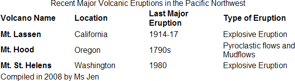
Figure 2: Table with left alignment applied.
Currently all of the cells are vertically aligned to the centre. If you prefer, you can set this to align text to the top or bottom of the cell, or in fact any vertical-align setting that you like. The new rules below set the text to align to the top:
table {
  width: 100%;
}

th, td {
  width: 25%;
  text-align: left;
  vertical-align: top;
}
The table now looks like Figure 3:
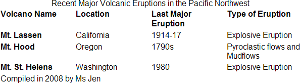
Figure 3: Table with vertical alignment added.
Note how the top row of headings all sit at the top, even though “Last Major Eruption” wraps on to two lines.
Borders
The table is looking a little nicer, however it is still a bit hard to read along each line. It’s time to set some borders to make things easier to read. You need to set borders separately for each part of the table, then decide how those borders should combine.
To show where the borders will be set, Figure 4a shows different borders for table (solid black), caption (solid grey), th (dashed blue) and td (dotted red):
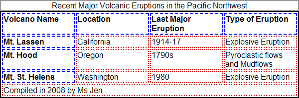
Figure 4a: illustration of the different element borders within a table.
Note how the table border runs around the outside of all the heading and data cells, then between the cells and the caption. You can also see that by default, the th and td borders are spaced out from each other.
Let’s look at a different style of table - you can set up a simple black border for the table and cells, using the border property — this is done via the new rules below:
table {
  width: 100%;
  border: 1px solid #000;
}

th, td {
  width: 25%;
  text-align: left;
  vertical-align: top;
  border: 1px solid #000;
}
Which produces the result seen in Figure 4b:
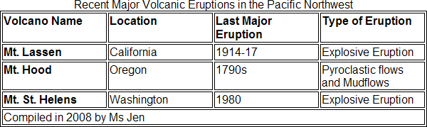
Figure 4b: Table with simple black borders applied.
This makes the rows far easier to read, however you may not like the spacing between the cells. There are two ways to change this.
First, you can simply close the gaps using the border-spacing property, like so:
table {
  width: 100%;
  border: 1px solid #000;
}

th, td {
  width: 25%;
  text-align: left;
  vertical-align: top;
  border: 1px solid #000;
  border-spacing: 0;
}
This will make the borders touch together instead of sitting apart. This changes the 1px border into a 2px border, as seen in Figure 5:
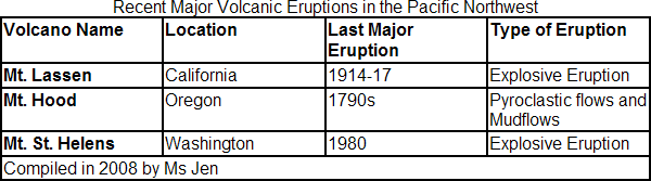
Figure 5: Table with border spacing removed, producing a 2px border effect.
You can also increase the space between cells using border-spacing, although bear in mind that this property doesn’t work in Internet Explorer.
If you want to retain the 1px border effect, you’ll need to set the table so that the borders “collapse” into each other. You can do this using the border-collapse property instead of the border-spacing property:
table {
  width: 100%;
  border: 1px solid #000;
}

th, td {
  width: 25%;
  text-align: left;
  vertical-align: top;
  border: 1px solid #000;
  border-collapse: collapse;
}
This will produce a table with a 1px border, like in Figure 6:
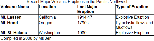
Figure 6: Table with border-collapse set to collapse, reducing the border to 1px.
When you set borders to collapse, you need to keep in mind that this can cause issues if you have different border styles applied to adjacent cells. When the different border styles are collapsed into each other, they will “conflict” with each other. This is resolved according to the W3C CSS2 Table border conflict resolution rules, which determine which style “wins” when they are collapsed.
Padding
Now that you have borders on the cells, you might like to add some whitespace to the caption and table cells. You simply use padding to accomplish this:
table {
  width: 100%;
  border: 1px solid #000;
}

th, td {
  width: 25%;
  text-align: left;
  vertical-align: top;
  border: 1px solid #000;
  border-collapse: collapse;
  padding: 0.3em;
}

caption {
  padding: 0.3em;
}
This allows the text to “breathe” a little, as seen in Figure 7:
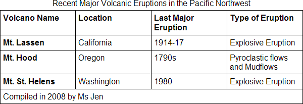
Figure 7: Table with padding applied to all cells.
Caption placement
So far the caption has been left sitting at the top of the table. However, you might like to move the caption somewhere else. Unfortunately you cannot do this in IE, but for all other browsers you can change the position of the caption using the caption-side property. The options are top, bottom, left and right. Let’s move the caption to the bottom:
table {
  width: 100%;
  border: 1px solid #000;
}

th, td {
  width: 25%;
  text-align: left;
  vertical-align: top;
  border: 1px solid #000;
  border-collapse: collapse;
  padding: 0.3em;
  caption-side: bottom;
}

caption {
  padding: 0.3em;
}
Figure 8 shows the result.
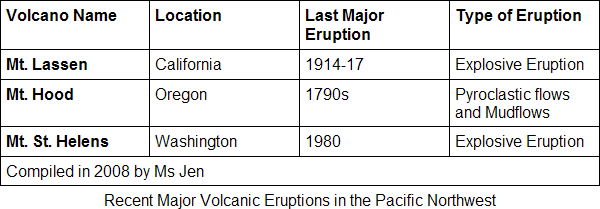
Figure 8: Table with caption moved to the bottom of the table.
If you do want move the caption, remember that any side-specific styles will not work in IE. For example if you add three borders to make the caption “join” the bottom of the table, it won’t have the desired effect in IE because the caption will still be at the top. You will need to use conditional comments to re-style your table for IE. See also the Fixing IE with conditional styles specification section for more details.
For the rest of the examples, we will leave it at the top.
Backgrounds
Another simple way to style tables is to add background colours and images. This is done with the background property, although you need to be aware that the different parts of the table will “layer” over each other. The CSS2 specification explains background layering in some detail however the short version is that backgrounds will override each other in the following order:
- table (which sits at the “bottom” or the “back”)
- column groups
- columns
- row groups
- rows
- cells (“top” or "front", meaning their background overrides all the others)
So, if you set a background for the table, and a different colour for cells, the cell background will cover up the table background. If you have borders set to collapse, the table background won’t show at all. If you set border-collapse to separate, however, the table background will show through between the borders.
Note that the concept of different elements sitting on top of one another on the page is controllable; you can control how high or low in the stack an element sits in relation to other elements by changing its z-index property.
Imagine you set the table to have a red background and cells to have a white background. Separated cells will show the red, but the cells stay white, as demonstrated by Figure 9:
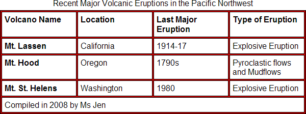
Figure 9: Table demonstrating the red table element background showing between the white backgrounds of the cell elements.
You can also use a background image. For example, if you wanted to have a gradient showing through between the cells, you could set the th and td cells to white backgrounds, but set the table background to a gradient:
table {
  border-collapse: separate;
  border-spacing: 5px;
  background: #000 url("gradient.gif") bottom left repeat-x;
  color: #fff;
}

td, th {
  background: #fff;
  color: #000;
}
Note that the background colour is set to black, which will fill up the space at the top where the gradient graphic finishes (you should always allow for your table being taller than the background image). The foreground colour is set to white, in case these default colours ever show through to the cell content. In general, the cell styles will override the text colour settings from the table {} style, but you should always declare contrasting foreground and background colours at each level.
These styles produce a table which would look like Figure 10 in most browsers:
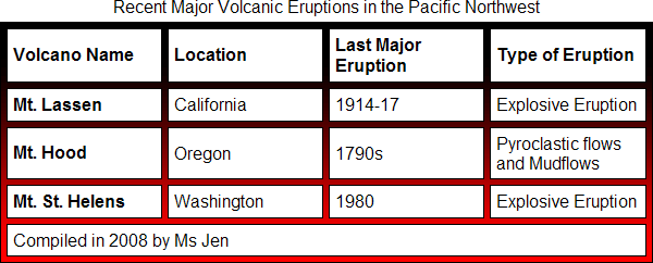
Figure 10: Table demonstrating a gradient background image showing through between the cells.
By default IE won’t show as much of the background, since it doesn’t support border-spacing. However you will still get the same general effect, as indicated by Figure 11.
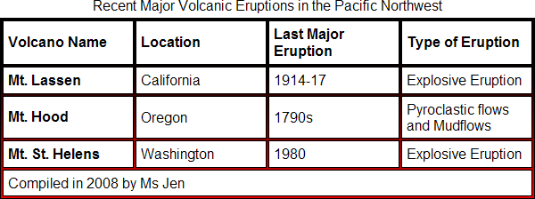
Figure 11: The smaller border-spacing gap rendered by IE.
Depending on your circumstances, you may be happy to simply accept this different rendering between browsers. Of course that isn’t always an option, for example when a client particularly wants a design to look exactly the same in all browsers.
Fixing IE with conditional styles
There is a workaround for the IE problems listed above. It requires a hack and an extra stylesheet, but it works. You can use an expression to produce the wider gap, then load that expression using conditional comments. The expression syntax is:
table {
  border-collapse: expression("separate", cellSpacing = "5px");
}
This CSS is only useful to IE, so you only want IE to apply it. The expression will also invalidate your stylesheet, so many developers prefer to isolate IE hacks in a separate stylesheet only loaded by IE.
To do this, create a new stylesheet named ie-only.css and link it within conditional comments:
<!--[if lte IE 7]><link rel="stylesheet" media="screen" href="ie-only.css" /><![endif]-->
Note the [if lte IE 7] means "if less than or equal to IE version 7". This reveals the code to IE7 and all earlier versions of IE, while the surrounding HTML comment hides the code from all other browsers. You can adjust this to whichever version of IE you need to target, for example to target IE6 and earlier use [if IE 6].
In your main stylesheet, set the normal style:
table {
  border: 1px solid #000;
  border-collapse: separate;
  border-spacing: 5px;
  background: #000 url("gradient.gif") bottom left repeat-x;
}
Then set your IE-only style in ie-only.css:
table {
  border-collapse: expression("separate", cellSpacing = "5px");
}
This will get IE to produce a table with wide cell spacing. You just have to remember to maintain the extra width settings — if you update your main stylesheet, you will have to update ie-only.css as well. Obviously conditional comments allow you to do a lot more than just style tables, since the extra stylesheet can contain as much CSS as you need to fix IE bugs.
A simple design
Most designs use relatively simple combinations of backgrounds. Let’s give the table headers a grey background, and change the caption to be white text on black:
table {
  width: 100%;
  border: 1px solid #000;
}

th, td {
  width: 25%;
  text-align: left;
  vertical-align: top;
  border: 1px solid #000;
  border-collapse: collapse;
  padding: 0.3em;
  caption-side: bottom;
}

caption {
  padding: 0.3em;
  color: #fff;
  background: #000;
}

th {
  background: #eee;
}
This looks like Figure 12:
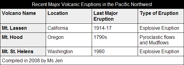
Figure 12: Table with reversed white-on-black caption and light grey background applied to the table heading cells.
Common variations
In this section I will look at some common design archetypes you will see again and again in tables across the Web.
Zebra striping
A common design request for tables is to create rows with alternating colours. These are commonly referred to as "zebra striping". Although there is some conjecture as to whether zebra striping actually helps the reader, they are a popular style. Figure 13 shows an example:
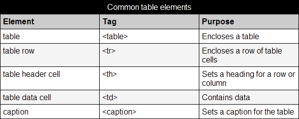
Figure 13: A table with "zebra stripes", alternate rows set to white or light grey.
The simplest way to accomplish zebra stripes is to add a class to alternate table rows, then use a contextual CSS selector to style the cells in those rows. First, the classes “odd” and “even” are added to the table rows, like so:
  ...

<tr class="odd">

  ...

<tr class="even">

...
You can skip the heading row as it already has its own style. You then add a contextual class to set the background for all cells inside odd class rows:
.odd th, .odd td {
  background: #eee;
}
This is the simplest way to add zebra striping to an HTML table that will work across all browsers, but it is not perfect — what if you add a row to the table? You’d then need to move all your odd and even class names around to get everything looking right again.
There are two other options:
- You can add the classes using unobtrusive JavaScript, as demonstrated in A List Apart: Zebra Tables. Most JavaScript frameworks have a suitable method, too: Zebra Table Showdown compares a range of framework implementations.
- You can use the CSS3
:nth-childselector, however, this isn’t supported across all the major browsers yet. Support will improve as time goes on though. You can find more out about zebra striping with nth-child in this dev.opera.com article.
Incomplete grids
Some designs will respond well to less structured, more open-looking grids. A simple variation is to remove the vertical borders and leave out the background fill on the caption, as seen in Figure 14:
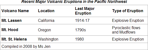
Figure 14: A table with lighter grey borders only on the outer edge and bottom of each cell.
The CSS for this effect is:
table {
  width: 100%;
  border: 1px solid #999;
  text-align: left;
  border-collapse: collapse;
  margin: 0 0 1em 0;
  caption-side: top;
}

caption, td, th {
  padding: 0.3em;
}

th, td {
  border-bottom: 1px solid #999;
  width: 25%;
}

caption {
  font-weight: bold;
  font-style: italic;
}
You can take this a step further and remove all of the borders, except a top and bottom border to give some definition to the table body — see Figure 15:
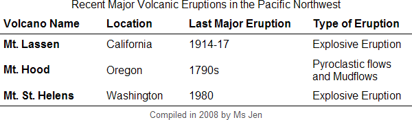
Figure 15: A table with borders applied only to the top and bottom of the table body.
The CSS for this effect is:
table {
  width: 100%;
  text-align: left;
  border-collapse: collapse;
  margin: 0 0 1em 0;
  caption-side: top;
}

caption, td, th {
  padding: 0.3em;
}

tbody {
  border-top: 1px solid #000;
  border-bottom: 1px solid #000;
}

tbody th, tfoot th {
  border: 0;
}

th.name {
  width: 25%;
}

th.location {
  width: 20%;
}

th.lasteruption {
  width: 30%;
}

th.eruptiontype {
  width: 25%;
}

tfoot {
  text-align: center;
  color: #555;
  font-size: 0.8em;
}
Inner grids
Sometimes you will want to remove the outer border, but keep the inner grid of borders, like in Figure 16:
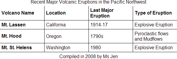
Figure 16: A table with an inner grid design.
To accomplish this for all current browsers, you need to add a class to the th and td cells that appear last on each row, like this:
  ...

<tr>
  <th scope="col">Volcano Name</th>
  <th scope="col">Location</th>
  <th scope="col">Last Major Eruption</th>
  <th scope="col" class="last">Type of Eruption</th>
</tr>

...
Then we use that class to remove the right border from those cells. The full CSS is:
table {
  width: 100%;
  text-align: left;
  border-collapse: collapse;
  margin: 0 0 1em 0;
  caption-side: top;
}

caption, td, th {
  padding: 0.3em;
}

th, td {
  border-bottom: 1px solid #000;
  border-right: 1px solid #000;
}

th.last, td.last {
  border-right: 0;
}

tfoot th, tfoot td {
  border-bottom: 0;
  text-align: center;
}

th {
  width: 25%;
}
Inner grids using :last-child
When browser support improves, we will be able to use the pseudo selector :last-child to achieve this effect without classes. The CSS would be:
table {
  width: 100%;
  text-align: left;
  border-collapse: collapse;
  margin: 0 0 1em 0;
  caption-side: top;
}

caption, td, th {
  padding: 0.3em;
}

th, td {
  border-bottom: 1px solid #000;
  border-right: 1px solid #000;
}

th:last-child, td:last-child {
  border-right: 0;
}

th {
  width: 25%;
}
This currently works in the latest versions of Opera, Firefox and Safari.
Two common bugs
In this last section we’ll cover two really common bugs, so you’re prepared for when they crop up. They concern borders and captions.
border-collapse bug
When you set your table to border-collapse: collapse; you will find that Firefox and Safari will incorrectly display the width of table features. For example, if you set a 1px border on the table, cells and caption, Firefox will render the caption 1px too narrow on the left, as seen in Figure 17:
Figure 17: The border-collapse bug affects Firefox and Safari.
Safari does the same thing, just on the right. This bug is all based on a rounding issue that ultimately comes down to how you display "0.5 of a pixel". It can be argued that this is not a bug per se, but the browsers don’t agree, so it’s effectively a bug.
So what’s the solution? If you want to use a 1px border and a caption background, there really isn’t a fix other than to "live with it ". It is a very minor difference and a non-fatal problem — that is, the table remains entirely usable. So, many people choose to just live with the differences between browsers. Let the Web be the Web.
If you are happy to use a larger border, say 2px, then you can simply set a 1px border on table, cells and caption; then set table to separate borders and apply zero spacing between them:
table {
  border-collapse: separate;
  border-spacing: 0;
  border: 1px solid #000;
}

th, td, caption {
  border: 1px solid #000;
}
In Firefox at least, the 1px borders will add up to the desired 2px rendered border, avoiding the rounding problem on the way. Safari still leaves a gap.
Alternatively, you can hide the problem by not using a border or background colour on your caption. The problem is still there; you just won’t see it. This is probably the simplest and most effective solution.
Margin/caption bug
If you use a caption and set a margin on table, you need to be aware that Firefox and Safari may place the table margin between the table cells and the caption.
To combat this in Firefox, you can set the margin on three sides of table, set the caption-side explicitly, then add the fourth margin to the caption. Unfortunately, this solution will invoke the bug in Safari. So, this isn’t really a fix unless you are willing to live with the bug in either Firefox or Safari.
The only way to avoid a problem in both Firefox and Safari is to set a zero margin on the side with the caption. For example, if your caption is at the top you could just set your margin on the right, bottom and left sides; or just the bottom. This may work if you set all of your margins on the same side of content elements, so the margin isn’t required to space the table from adjacent content.
See also
External resources
- W3C: CSS2 Tables, with particular reference to the CSS2 table background layering section.
- A List Apart: A Dao of Web Design—"let the web be the web". A timeless article which will explain why a 1px difference between browsers doesn’t truly matter.
- A List Apart: Zebra Tables and A List Apart: Zebra Striping: Does it Really Help?
- Zebra striping tables with CSS3
- A CSS styled table & A CSS styled calendar
- Data Tables and Cascading Style Sheets Gallery shows off a variety of table designs (although be aware many do not meet W3C colour contrast recommendations).
Exercise questions
- How do you control the space between table and cell borders?
- What happens when
tablehas one background colour,thandtdcells have another background colour, andborder-collapseis set tocollapse? - How do you set different columns to have different widths?