Styling forms
Summary
This article provides a grounding in form styling and layout — one of the more difficult aspects of styling web pages.
Introduction
The HTML forms article introduced you to the basics of form creation and styling. This article carries on where that left off, providing more details about form elements and styles, and how forms are included in real-world Web application designs.
Concepts introduced in this article
Here you will find new information about form implementation and interface layout.
Rule and token overloading
Using copious numbers of class and id tokens can be said to violate the KISS Principle (“Keep It Simple, Stupid”). However, demanding layouts often create conflicts in the cascade — conflicts that are most easily resolved by adding tokens to elements, and writing stylesheet rules that contain several selectors.
The most demanding layouts are littered with edge cases, which are often best handled by assigning an id to elements that define a narrow and unique context.
New form field elements
An effective form often needs more than just buttons and text input fields, because it’s common to frame user responses in terms of options. HTML provides several options for the designer who encounters this requirement.
Form design principles
A site’s forms are usually focal points for user interaction and data collection. For this reason, they are often critical to a site’s success, which demands that the greatest care should be taken with their design.
The Rule of Thirds
Users are more likely to draw their attention to four specific points on a canvas (and the lines that pass through them). This article introduces the reader to that phenomenon, and offers suggestions on how to best exploit it with CSS.
Grids
Previous articles have explained how to ensure consistent typesetting and get the most use from whitespace. This article takes things a step further by explaining how em units can be used to enforce a degree of layout consistency that cannot be accomplished without CSS.
Platform support tiers
One common requirement among commercial projects is near-exact rendering of the approved site design across two or more browsers. This article will briefly explore the causes, effects, and processes related to satisfying this requirement.
A simple contact form
Contact forms that allow site visitors to send e-mail directly to an inbox are very common, for obvious reasons: they’re accessible to anyone with an active e-mail address, and easy to filter into a dedicated mail folder.
The markup used in the HTML forms article uses such a form, which has been extensively embellished:
Markup
<form id="contactForm" method="post" action="/cgi-bin/service_email_script.php">
  <ul>
    <li id="nameField" class="required"><label for="realname">Name:</label><input type="text"
      name="name" value="" class="medium" id="realname" /><span
      class="note">required</span></li>
    <li id="addressField" class="required"><label for="address">Email:</label><input
      type="text" name="email" value="" class="medium" id="address" /><span
      class="note">required</span></li>
    <li id="subjectField"><label for="natureOfInquiry">General
    subject:</label>
      <select name="subject" class="medium" id="natureOfInquiry">
        <option value="support">Support</option>
        <option value="billing">Accounts & billing</option>
        <option value="press">Press</option>
        <option value="other_q">Other questions</option>
      </select>
    </li>
    <li class="required" id="acctTypeField"><label for="acctNone">Account type:</label>
      <fieldset>
        <label for="acctGold">Gold</label><input type="radio" name="acct_type" id="goldAcct"
          class="rInput" />
        <label for="acctSilver">Silver</label><input type="radio" name="acct_type"
          id="acctSilver" class="rInput" />
        <label for="acctBronze">Bronze</label><input type="radio" name="acct_type"
          id="acctBronze" class="rInput" />
        <label for="acctNone">None</label><input type="radio" name="acct_type" id="acctNone"
          class="rInput" checked="checked" />
      </fieldset>
      <span class="note">required</span>
    </li>
    <li id="availabilityField">
      <label for="availability">My account is unavailable:</label><input type="checkbox"
        name="is_down" id="availability" class="rInput" /></li>
    <li id="messageField"><label for="messageBody">Comments:</label><textarea name="comments"
      cols="32" rows="8" class="long" id="messageBody"></textarea></li>
    <li class="submitField"><input type="submit" value="Send" class="submitButton" /></li>
  </ul>
</form>
Changes from the previous form
In addition to including several new elements, a number of classes and IDs have been added to the markup that can be referenced from the stylesheet. These allow each form, field/value pair, and field to be referenced individually, regardless of context.
The new identifiers also make it possible for the stylist to distinguish required fields from optional ones.
Finally, there are a few new classes that provide suggestions of the amount and types of information that should be displayed by the form elements to which they are attached. These classes make it possible to apply layout details to multiple, arbitrary elements all at once.
Apparent shortcomings
Since the demonstration form is understood to be primary content, the legend used in the previous forms article has been replaced with a heading.
Legends are most appropriate within fieldsets, in lieu of labels (which are meant to relate to single controls). In this instance the legend element has been omitted entirely, because it’s difficult to style.
Something else worth noting is that “required” tags on fields are best placed before the field in source order, to accommodate users of screen reader software. However, the position property (which is beyond the scope of this article) is necessary to lay these items out appropriately. For this reason, the “required” tags have been placed after their associated controls in the source order (albeit in the same context).
New form fields? What’s this?
Text fields and submit controls were introduced in the previous article. As pointed out above, there are a number of use cases that require the user to be able to select from two or more options. Those elements are described in brief below.
Choosing descriptions: input type="checkbox"
      ...
  <label for="availability">My account is unavailable:</label><input type="checkbox"
  name="is_down" id="availability" class="rInput" />
Opt-in and opt-out questions are usually handled with one of these controls. Another case in which they are used is when there is a need to choose arbitrarily from several options, eg, a list of personal interests.
Choosing from mutually exclusive states: input type="radio"
      ...
      <label for="acctNone">Account type:</label>
      <fieldset>
        <label for="acctGold">Gold</label><input type="radio" name="acct_type" id="goldAcct"
          class="rInput" />
        <label for="acctSilver">Silver</label><input type="radio" name="acct_type"
          id="acctSilver" class="rInput" />
        <label for="acctBronze">Bronze</label><input type="radio" name="acct_type"
          id="acctBronze" class="rInput" />
        <label for="acctNone">None</label><input type="radio" name="acct_type" id="acctNone"
          class="rInput" checked="checked" />
      </fieldset>
A group of these allows you to present several options side by side, of which only one can be chosen. One good example of a use case for a set of radio controls is the assignment of a rating on a 1–5 or 1–10 scale.
Unlike other form controls, radio controls not only allow but actually require that associated controls share the same name.
These elements take their name from an interface common to mechanically tuned car radio sets. Unlike the programmable presets common to digitally tuned sets, mechanical “preset” buttons typically center the receiver on a range of frequencies within the band being tuned in, when pressed.
Both checkbox and radio controls allow a checked attribute, which if set activates the control by default when it is first rendered.
The question of using radio controls instead of checkbox controls is best answered after considering a number of different factors. If you want the user to confirm a subjective choice (such as opting in to a mailing list), then checkbox controls are probably best. If you want instead for a user to choose between two objective options (for example, gender), then radio controls should be used instead.
When there are just too many choices: select/option
    ...
    <label for="natureOfInquiry">General
    subject:</label>
      <select name="subject" class="medium" id="natureOfInquiry">
        <option value="support">Support</option>
        <option value="billing">Accounts & billing</option>
        <option value="press">Press</option>
        <option value="other_q">Other questions</option>
      </select>
The select and option elements offer results similar to those provided by a series of radio controls, while taking up much less space. Choosing a select element in preference to a series of radio controls is often a matter of how the space within the user interface is used; a long list of geographical areas or departments within an e-commerce site is typically better suited to a select elements, while a shorter series of choices (eg yes/no, true/false, age ranges, income ranges) should instead be laid out as series of radio controls.
Thoughtful self-testing will reveal that the level of fine motor control required to manipulate a select list is high, but increases only slightly in proportion to the number of options it contains. The practical result is that short lists of mutually exclusive options are best formatted as a series of radio controls with properly written labels.
Grouping series of controls: fieldset
The principal purpose of the fieldset element is to assign a single context to a series of closely related controls (text controls for a phone number, select elements for a date, etc.).
Starting from scratch, ending with a finished form
Now that the new material in this article has been outlined, it’s time to see that material in action — the twelve demonstrations that follow progress through various design concepts and styling challenges that are encountered when developing Web forms.
Readers are strongly encouraged to save the demonstration material to their own hard drives and experiment with the stylesheet rules.
These demonstrations progress in source order, rather than the order in which the stylesheet was authored. The reasons and implications of that deviation are discussed later in this article.
Demonstration 1
Starting with a rule that reads html { margin: 0; padding: 0; }, the first step is to configure the body of the containing page.
New styles:
body {
  margin: 0;
  padding: 1.714em;
  background-image: url(images/bg_grid.gif);
  font-size: 14px;
  font-family: Helvetica,Arial,sans-serif;
  line-height: 1.714em;
}
Demonstration 1: background considerations
- When XHTML is served with the proper
Content-Type, to a user agent that supports it properly, default pagemarginand/orpaddingare rendered in thehtmlelement. - In cases other than that described in the above bullet, a 10px gutter is placed around the circumference of the page; Opera provides this as a
paddingvalue, while other mass market browsers provide it (somewhat counterintuitively) as amarginvalue. The demonstration stylesheet normalizes the result. - While many accessibility purists will object to the
14pxtypesize value, it’s integral to the various box and type properties specified elsewhere in the stylesheet, denominated in sevenths of anemfor the most part. A fraction-to-decimal conversion chart is provided at the end of the article for those who want some insight on the arithmetic used. - The
14pxvalue was chosen because it’s the smallest size of body copy that can be read by practically everyone with corrected vision. - Since one of the purposes of this article is to demonstrate the work that goes into a superlatively consistent grid, a grid background in increments of 24 pixels has been applied to the page.
Demonstration 2
Now that the page containers have been wrangled, the next couple of steps alter or remove user agent styles.
New styles:
h3 {
  margin: 0 0 1.2em 0;
  border-bottom: .05em solid rgb(0,96,192);
  font-size: 1.429em;
  line-height: 1.15em;
}

form {
  width: 35.929em;
  margin: 0;
}

ul {
  margin: 0;
  padding: 0;
  list-style-type: none;
}
Demonstration 2: background considerations
- The progression of typesize for headings varies from one platform to the next; however, the default values are always a proportion of the
mediumvalue used for unstyled paragraph text, and thus are inherited via the cascade. The result of the value provided here is to change the default proportion. - It’s considered optimal to use
h1for the first heading on a page; here that practice is ignored because in a commercial production environment, the site title is often anh1on page and the page title should be placed lower in the heading hierarchy. In many cases, the form’s prominence will be equal to the prominence of other content or forms in the same document. - The goal of the
h3styling is to create a content box 24 pixels high with 24 pixels of gutter immediately below, so that:
(((14 × 1.429) × 1.15) + (20 × .05)) ≈ 24
 14 * 1.429 ≈ 20; 20 * 1.15 == 23; 20 * .05 == 1;
(20 × 1.2) = 24
- The assignment of a
widthvalue to either theformor the list items is needed, if the elements are to be properly justified without relying on positioning. The value used yields a static value of 503 pixels; the one pixel discrepancy (given an atomic grid unit of 24 pixels) is a product of errors produced by rounding and anti-aliasing. - The default useragent styles for lists vary from one browser to the next. Internet Explorer gives each list item a left margin of 40 pixels and places the item bullet in the resulting gutter, while other browsers apply padding to the left side of the form’s content block as a whole. As with the layout properties changed in the
bodyrule, this rule is designed specifically to normalize presentation across browsers.
Demonstration 3
Now to set up the containers for form elements.
New styles:
li {
  clear: both;
  height: 1.714em;
  margin: 0;
}

fieldset {
  height: 1.429em;
  margin: 0 0 -.143em 0;
  border: 0;
}
Demonstration 3: background considerations
- If one thinks of the form as a series of rows, the need to style the height of each in order to preserve a grid becomes obvious. The margins of the list items are set to zero for the benefit of Internet Explorer, and for good measure otherwise.
- Because many elements in the form will be given
floatvalues, the containing list items are assigned a value ofclear: bothto ensure that each will fall below its predecessor as a matter of course. - Apart from the removal of the border (which is part of the user agent default style), the layout properties of the
fieldsetappear to have been set arbitrarily. In fact, they were assigned after cross-browser testing, which is discussed again briefly in the notes attached to Demonstration 11. - At this point, no
displayorfloatvalues have been assigned, which explains why the contents of thefieldsetcollide with the followingselectcontrol.
Creating a grid
One of the most significant strengths of good graphic design (and with it, good interface design) is that things are laid out at predictable intervals. These intervals are typically referred to as the grid.
As pointed out above the atomic grid unit of the demonstration form is 24 pixels square, but there’s more to coherent layout than ensuring that design elements are placed at small-yet-predictable intervals. A truly effective grid has the following characteristics:
- Column margins are placed at consistent grid intervals throughout the document.
- Sequential sections within the same document share top margins with items in neighboring columns.
- Illustrations within a layout are cropped or matted to dimensions that respect the widths of both columns and atomic grid intervals.
- Even in cases where content falls into a single column punctuated with
floated elements, the latter elements all share close commonalities of size and composition.
Layouts that manifest these characteristics are more attractive and easier to follow, which makes for a more usable site.
Creating the framework of a grid within a composite
The tool used by most professionals to create site layout composites is Adobe Photoshop, and one of its strengths is the easy access to grid lines that it provides. To display an atomic grid in Photoshop, you can select View → Show → Grid, which will display grid lines at the intervals set in Guides & Grid Preferences.
Superimposing guides for things like columns is then accomplished by selecting View → Rulers, switching to the Move tool, and dragging the pointer from the ruler as needed.
Enforcing the grid in your stylesheet
As the text styling article points out — reinforced by a few of the rules included in the demonstration stylesheet — the best way to enforce an atomic grid within a layout is to rely on em units. However, that by itself is not enough; the stylist must also keep their fraction-to-decimal conversions straight when dealing with alternate type sizes, gutters, and borders.
Another technique for enforcing grids is revealed in the demonstration stylesheet: the provision of class tokens that can refer to various element and column sizes in a document. When used consistently, these tokens do most of the work of enforcing your grid.
Demonstration 4
Keeping things aligned to a grid means assigning layout properties to the labels and form controls.
New styles:
label {
  display: block;
  float: left;
  clear: left;
  width: 10.286em;
  overflow: auto;
  padding-right: 1.714em;
  text-align: right;
}

input {
  height: 1.143em;
  border: .071em solid rgb(96,96,96);
  padding: .071em;
  line-height: 1;
}
Demonstration 4: background considerations
- All form controls, including textareas and labels, are rendered as
%inlineelements by default. - In order to create a consistent left column, a
widthmust be assigned to thelabelelements; in “strict” rendering mode, thepaddingsupplied alongside makes a workable gutter between controls and labels a certainty. - Making both labels and controls flush to a common margin makes the form easy to follow. This fact and other points of composition are discussed as part of the discussion of the Rule of Thirds (below).
- At this point, there are obvious problems with the form:
- The
labels attached to theradiocontrols are assigned the samedisplayandfloatvalues as the otherlabels on the form. In tandem with the existingheightandoverflowvalues, these elements collide with the following label-control pair in some browsers. - In Safari 3, the borders of text controls disappear in this slide. One suspects that this is a rendering bug.
- The
radiocontrols appear flush to one another in source order; this occurs because the interveninglabelcontrols are presently in a different layout context.
- The
- Another curiosity that bears mention is the assignment of
overflow: autoto labels. The magic dust being applied here can be described as a rule: given one%blockelement within another, and given that only one of those has aheightspecified in static units orems that expand to a known number of pixels, assigningoverflow: autoto the other element — the one without aheightvalue — will cause it to expand to the height of the element with a discreteheightvalue. This technique is also used in Demonstration 11.
The Rule of Thirds
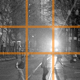
Figure 1: An early springtime scene in Portland, Oregon. This photo has been superimposed with lines illustrating the Rule of Thirds; note how the lower right intersection and the lines that form it bound the visible activity. Photo ©2000 by the author; all rights reserved.
When we consider what makes for excellent composition, there’s a nearly universal trope: if you divide a layout or illustration into thirds, you will discover that viewers want to draw their attention to the lines (and especially the intersections of the lines) that mark those divisions. Failure to put this uncanny tendency to work can cause a layout to seem unbalanced.
The simplest explanation for this phenomenon is that those four lines conform closely to grids that follow the Golden Ratio, a proportion that is close in value to one-sixth. The Golden Ratio is frequently encountered in various fields of mathematics and in the natural world.
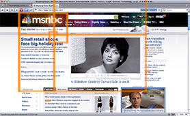
Figure 2: A screen capture of msnbc.msn.com superimposed by the first seven golden rectangles. The dimensions of the fourth and fifth rectangles side-by-side illuminate the nature of the page layout grid as a whole.
The demonstration form was laid out so that the form controls would justify to a left margin placed one-third of the distance to the notional right margin of the form as a whole; this choice was deliberate. Much less deliberate is the vertical composition of the form — when the heading is taken into account, the text fields hew to the two lines described in the preivous paragraph. Even if the heading isn’t taken into account, the required fields hew to the uppermost of those lines.
The salient point for a stylist is that if the Rule of Thirds and the grid are taken into account before starting work on a stylesheet, the task of normalizing the stylesheet can be simplified considerably.
Demonstration 5
To ensure that the intended grid is preserved vertically as well as horizontally, some particulars need to be seen to. These changes are almost entirely cosmetic.
New styles:
textarea {
  height: 4.714em;
  margin-bottom: .286em;
  border: .071em solid rgb(96,96,96);
  padding: 0;
}

select {
  display: block;
  float: left;
  height: 1.571em;
  font-family: Futura,'Century Gothic',sans-serif;
}

option { font-size: 100%; }
Demonstration 5: background considerations
- On Windows platforms,
selectcontrols can be altered to remove some beveling, which makes them resemble the text controls more closely. - Since ease of use is generally improved by giving the user a way to distinguish at a single glance their input from the rest of a form, the typeface used to represent form values will be different from that used on the rest of the form. With this in mind, this demonstration applies the first of those values.
- The cascade tends not to be observed with respect to text rendering in form controls, which is another reason why there are a number of text/font values in evidence here.
inheritwas avoided as a matter of preference and habit, but not for any objective reason.
Demonstration 6
The previous demonstration manipulated some type rendering; now it’s time to finish the job.
New styles:
input, textarea {
  display: block;
  float: left;
  overflow: hidden;
  font-family: Futura,'Century Gothic',sans-serif;
  font-size: 1em;
}

input, textarea, select {
  margin-top: 0;
  font-size: 100%;
}
Demonstration 6: background considerations
- In this demonstration we see the first instance of values that have been deliberately put aside for simultaneous assignment to multiple selectors. The absence of
bordervalues from these rules is an artifact of the production process, which was conducted in a different order than the presentation of these demonstrations — a point which is discussed in more detail later. - As mentioned above, text and font values in form controls do not get the benefit of the cascade. These rules address that issue. Consequently, most of the various controls now conform to the desired layout.
- Because of the behavior of Internet Explorer 6, the balance of the form controls are given a
floatvalue ofleft. This value was assigned out of habit informed by (unpleasant) experience, but is not strictly necessary. - With the assignment of
blockvalues to the text controls, the Safari rendering problem seen in the two previous demonstrations has suddenly been resolved. Oddities like these are common when styling forms. - Just as
bordervalues were not properly normalized, nor werefont-sizevalues; the assignment of1emvalues to text controls and100%values toselectcontrols was entirely arbitrary.
Demonstration 7
The widths of the various text controls need to be changed from their default values.
New styles:
.medium { width: 11.714em; }

select.medium { width: 12em; }

.long { width: 20.429em; }

.rInput { border: 0; }
Demonstration 7: background considerations
- A re-examination of the source markup will reveal that each control has been assigned a
class— one of three width-related controls for text andselectcontrols, and other classes for controls that rely on pointer/cursor input rather than keyboard input. - Classes need to be assigned to controls mostly because Internet Explorer’s support for advanced selectors is limited. As selectors go, the
rInputclasscould just as easily be superseded byinput[type="radio"], input[type="checkbox"]… if current production versions of Internet Explorer supported the latter at all. - The assignment of three possible values for text controls is entirely arbitrary, and left up to the designer. In commercial settings, some designers deliver work so particular about layout that
classselectors like those used here would be functionally useless. Assigning anidto each label/control pair provides the simplest possible reference to each element with the form — simplicity that’s valuable when styling the work of a designer who insists on putting his touch on every little nook of the site layout.
Demonstration 8
The form’s submit button has been languishing…
New styles:
.submitButton {
  display: block;
  clear: both;
  width: 7.2em;
  height: 2em;
  margin: 0 0 0 16.8em;
  border: 1px solid rgb(128,128,128);
  padding: 0;
  font-size: 10px;
  text-align: center;
}
Demonstration 8: background considerations
- The greatest challenge faced when styling submit buttons is to compose them exactly as desired by the designer. In common practice the desired look is obtained only after extensive dithering with layout and
line-heightproperties; some developers might find it less time-consuming to use image replacement (see Bibliography) orinput type="image"instead. - At first glance, the assignment of
display: blockto this item appears redundant — and certainly is, if we think solely in terms of a single form on a single page. However, in the context of an entire site it might not be redundant; many sites and applications have multiple forms in one document with differingdisplayvalues.
Demonstration 9
Put the “required” tags where they belong.
New styles:
li.required span.note {
  display: block;
  width: auto;
  float: right;
  color: rgb(128,128,128);
  font-size: .714em;
  line-height: 2.4em;
  font-style: italic;
}
Demonstration 9: background considerations
- In its current state, the
fieldsetcontaining theradiocontrols is still a block element, so it stretches all the way to the right margin of the form. As a result, the tag attached to this set of controls is pushed below the calculated bottom of thefieldset. - The
autovalue supplied for thewidthof the “required” tags mandates that they should be no wider than their content. - A closer look at the arithmetic used for the typesetting of the “required” tags will reveal a typesize of ten pixels, and leading of 24 pixels (equivalent to one atomic unit of the grid being used).
- The structure used to indicate required fields was built with user interactivity in mind; with the various classes applied to the form it’s possible to validate user input with JavaScript and change the styling of labels, fields, and/or tags in label/control sets that were not properly manipulated by the user.
Demonstration 10
It’s finally time to settle up the collisions of the radio controls with the fields below them in the source order.
New styles:
fieldset label {
  margin-right: .25em;
  padding-right: 0;
  line-height: 1;
}

fieldset .rInput { margin-right: .75em; }

fieldset label, fieldset .rInput {
  width: auto;
  display: inline;
  float: none;
  font-size: .857em;
}

li.required fieldset {
  width: 18.857em;
  float: left;
}
Demonstration 10: background considerations
- The main result of these rules, apart from making cosmetic adjustments, is to change the
displayvalue ofradioandcheckboxcontrols back toinline. This is done to avoid the hassles that go in hand with floating them like the rest of theinputelements in the form. - In spite of the assignment of
display: inlineto the associated controls, they remain as “replaced” elements: inline elements with known static dimensions at runtime (ie, before the browser actually begins to render the content). For this reason margins can be applied to these items. - The peculiar nature of
fieldsetelements — specifically, that they are the only%blockelements intended specifically for use in forms — requires that a discrete width be applied in this case to anyfieldsetcontaining controls that require user activation. (See the discussion of the “required” tag layout values above.)
Demonstration 11
For the last hurrah, to get the last bits lined up just so…
New styles:
#acctTypeField fieldset {
  padding: .286em 0 0 0;
  line-height: normal;
}

#acctTypeField .rInput { margin-top: .167em; }

#availabilityField label {
  height: 3.143em;
  padding-top: .286em;
  line-height: normal;
}

#availabilityField .rInput { margin-top: .286em; }

#availabilityField, #messageField {
  height: 1%;
  overflow: auto;
}
Demonstration 11: background considerations
- The
overflowmagic applied in Demonstration 4 is repeated here;#availabilityFieldhas alabelof knownheight, and#messageFieldatextarealikewise. - The use of the
#acctTypeFieldtoken to change thepaddingvalue of thefieldsetit contains may well be too specific. However, delicate handling is called for when writing styles that can be so easily influenced by the styles of neighboring elements. - The rest of the rules in this stylesheet block make minor adjustments to layout, all of which were determined in the course of testing. Unfortunately, hours of testing and tweaking fail to reveal behavior that will produce identically composed
radiocontrols in both Safari 3 and Firefox 3. The result is a baseline on theradiocontrollabels that is off-kilter in Firefox 3. Generally, it can be said that stylingcheckboxandradiocontrols is something of a black art.
Demonstration 12
All of the preceding styles were developed for Opera or Safari (take your pick, they both behaved comparatively well). The ones that follow are specific to Internet Explorer, specified in a CSS file linked within a conditional comment block.
New styles:
h3 { margin-bottom: 1.2em; }
li { margin: 0 0 -.214em 0; }

select { height: 1.429em; }

textarea { height: 4.571em; }

fieldset {
  height: 1.583em;
  padding-top: .417em;
}

.medium { width: 13.429em; }

select.medium { width: 13.714em; }

.long { width: 20.286em; }

fieldset .rInput { border: 0 !important; }

#subjectField { margin-bottom: -.214em; }

#availabilityField .rInput { margin-top: .286em; }

#messageField { padding-bottom: .286em; }

input.submitButton { margin-top: .15em; }

* html input, * html textarea { float: left; }

* html select { font-size: .643em; }

* html select.medium { width: 21.364em; }

* html textarea { height: 4.643em; }

* html #subjectField {
  margin-top: .071em;
  margin-bottom: 0;
}

* html #availabilityField label { padding-top: 0; }

* html input.submitButton { margin: .1em 0 0 7em; }
Demonstration 12: background considerations
- As you can see, all of the styles displayed above suggest slight differences in the way that Internet Explorer cascades type sizes and lays out boxes.
- Another matter worth raising is the
* htmlselector. Internet Explorer 5 and 6 are the only browsers that recognize this selector, which makes it an effective low-pass filter for stylesheet rules targeted to those browsers.
Establishing platform support tiers
The last section of the demonstration illustrates the kind of styles set aside for Internet Explorer 6 and 7, and begs a discussion of how widely varying browsers are treated by the conscientous site design team.
The reality of the Web is that users run a wide assortment of browsers in all manner of environments. Some are old, while others are on the bleeding edge. Some run on fully featured computers, while others run on mobile devices such as telephones. All of them are developed on specific operating systems, then ported to others with varying degrees of standards support. With the exception of Opera, all browser vendors ship products that are designed to be used alongside other titles in a larger suite of products — a design requirement that makes those browsers more complex than necessary for the single task of browsing the Web.
As if the manifold strengths and weaknesses of browsers weren’t enough to consider, there is also the matter of bugs — security bugs, component bugs, and especially rendering bugs. Users of Safari 3.x have discovered that at one point, the demonstration document uncovers a discomfiting rendering bug in their own browser of choice.
The best manner of dealing with these issues is to define support tiers. This practice was first promulgated by the interface development team at Yahoo!, which refers to it as “Graded Browser Support.”
Generally, support tiers fall into four broad categories:
- Site renders as originally composed within the limits of these browsers’ capabilities, and all features are fully supported. The development platform defines what is sometimes called the “A+” tier.
- Deviation from the preferred composition is evident, perhaps to a significant degree; however, the site is still usable, and most if not all site features are supported.
- The site served to users of these browsers is as plain as can be managed without tarnishing the site owner’s brand, and site features may well be disabled. These browsers typically have comparatively small install bases and are judged to be outdated, unstable, or underfeatured.
- Referred to in the Yahoo! documentation as “X Grade” support, this level of support is reserved for untested platforms — typically newer browsers with small install bases (often Opera, natch). Once tested, such browsers are promoted to a higher tier.
The particulars of the requirements gathering process that inform the definition of support tiers and assign browsers to them run to the long and tedious, and for that reason will be omitted from this already long article.
Complex form layouts in practice (…instead of theory)
Among the background notes provided above, it was stated that the demonstration was staged in the stylesheet source order, rather than the order in which rules were actually added to the stylesheet. The reasons for doing so include:
- In order to outline a timeline-based series of demonstrations it was necessary to keep a journal (or to store the stylesheet in a versioning system) — a step that was never taken. By the time that oversight was noticed, this article was too far past deadline to correct it.
- Staging according to source order makes it far easier to produce the demonstration documents — yet another concession of the ideal to the practical.
- Since the original demonstration stylesheet was written with considerable (if not complete) care to normalization and source order — as all production stylesheets should be — staging the demonstration in source order guarantees that those students wishing to “View the Source” will have a far easier time making sense of what’s actually being served.
Opera 9.6 for OS X was the useragent used for development; with that caveat and the others above supplied, here’s the general order in which changes and additions were made to the stylesheet:
- Document (i.e.,
body) styles applied - list, form, and
fieldsetdefaults reset - typesetting specified
- list items constrained and
cleared labels laid out in whole- form control layout (especially sizes) specified and normalized
- submit button composed
- edge cases applied
- Safari and Firefox tested and stylesheet values changed to reflect compromises (where possible)
- Internet Explorer 6 and 7 tested and supplied with property/value adjustments in a conditional stylesheet
The process described above starts with the broadest rules, and narrows in specificity until specific quirks of individual browsers are addressed… much like the source order of the stylesheet itself. However, the results don’t correlate perfectly. This happens because multiple rendering engines and the peculiarities of things like float context bring about unforeseen consequences when stirred into the proverbial mix, so the actual process requires more than a little doubling back, tweaking, and reconsideration.
Table: fraction to decimal conversions
In the following table, digits contained within parentheses with an asterisk after them are infinitely repeated; for example 0.2(6*) is equivalent to 0.266666666666666… (6 repeats forever).
Values closest to zero are on the left side of the table, and progress toward one as the table is read from left to right.
| x | 1/x | 2/x | 3/x | 4/x | 5/x | 6/x | 7/x | 8/x | 9/x | 10/x | 11/x | 12/x | 13/x | 14/x | 15/x |
|---|---|---|---|---|---|---|---|---|---|---|---|---|---|---|---|
| 2 | .5 | ||||||||||||||
| 3 | .(3\*) | .(6\*) | |||||||||||||
| 4 | .25 | .5 | .75 | ||||||||||||
| 5 | .2 | .4 | .6 | .8 | |||||||||||
| 6 | .1(6\*) | .(3\*) | .5 | .(6\*) | .8(3\*) | ||||||||||
| 7 | .(142857\*) | .(285714\*) | .(428571\*) | .(571428\*) | .(714285\*) | .(857142\*) | |||||||||
| 8 | .125 | .25 | .375 | .5 | .625 | .75 | .875 | ||||||||
| 9 | .(1\*) | .(2\*) | .(3\*) | .(4\*) | .(5\*) | .(6\*) | .(7\*) | .(8\*) | |||||||
| 10 | .1 | .2 | .3 | .4 | .5 | .6 | .7 | .8 | .9 | ||||||
| 11 | .(09\*) | .(18\*) | .(27\*) | .(36\*) | .(45\*) | .(54\*) | .(63\*) | .(72\*) | .(81\*) | .(90\*) | |||||
| 12 | .08(3\*) | .1(6\*) | .25 | .(3\*) | .41(6\*) | .5 | .58(3\*) | .(6\*) | .75 | .8(3\*) | .91(6\*) | ||||
| 13 | .(076923\*) | .(153846\*) | .(230769\*) | .(307692\*) | .(384615\*) | .(461538\*) | .(538461\*) | .(615383\*) | .(692307\*) | .(769230\*) | .(846153\*) | .(923076\*) | |||
| 14 | .0(714285\*) | .(142857\*) | .2(142857\*) | .(285714\*) | .3(571428\*) | .(428571\*) | .5 | .5(714285\*) | .6(428571\*) | .(714285\*) | .7(857142\*) | .(857142\*) | .9(285714\*) | ||
| 15 | .0(6\*) | .1(3\*) | .2 | .2(6\*) | .(3\*) | .4 | .4(6\*) | .5(3\*) | .6 | .(6\*) | .7(3\*) | 8 | .8(6\*) | .9(3\*) | |
| 16 | .0625 | .125 | .1875 | .25 | .3125 | .375 | .4375 | .5 | .5625 | .625 | .6875 | .75 | .8125 | .875 | .9375 |
See also
External resources
- Bos, Bert, et al. 2007. Cascading style sheets level 2 revision 1 (CSS 2.1) specification. World Wide Web Consortium. etc. (accessed 28 May 2008).
- Henick, Ben. 2006. 12 lessons for those afraid of CSS and standards. A List Apart. (accessed 16 December 2008).
- Horton, Sarah, and Lynch, Patrick. 2002. Web style guide: basic principles for creating web sites, 2nd edition. New Haven, Conn.: Yale University Press.
- Knott, Ron. 2008. The golden section ratio: phi. Department of Mathematics, University of Surrey (UK). (accessed 18 December 1008).
- Meyer, Eric. 2007. Formal weirdness. Meyerweb.com. (accessed 17 December 2008).
- Microsoft Corporation. msnbc.com. (accessed 17 December 2008).
- Raggett, Dave, et al. 1999. HTML 4.01 specification. World Wide Web Consortium. etc. (accessed 30 June 2008).
- Reynolds, Garr. 2005. From golden mean to “rule of thirds.” Presentation Zen. (accessed 16 December 2008).
- Santa Maria, Jason. 2008. Making modular layout systems. 24 Ways. (accessed 16 December 2008).
- Wikpedia. 2008. Fahrner image replacement. (accessed 19 December 2008).
- Yahoo! Developer Network. 2008. Graded browser support. (accessed 16 December 2008).
Exercise questions
- What is the flow type of the form controls that accept user input, and what two characteristics make them remarkable with respect to layout?
- Which two attributes other than
valueanddisabledmanipulate form control settings in advance of user interaction, and to which elements do they apply? - The demonstration document provides for required fields. Write at least one style rule that would, at a single stroke, change the appearance of a field that contains an instance of user input error or omission.
- Describe one use case each for the
selectelement, thecheckboxcontrol, and theradiocontrol. Substantiate each description with an explanation of the advantages your choice lends when compared to other possible choices. - Using an online reference chosen by your instructor, find and briefly describe alternatives to
input type="submit". - Create a
selectelement that allows selection of multipleoptions by appending themultiple="multiple"attribute/value pair. After examining the behavior of that element, explain why it’s rarely encountered on production sites.